Create a Correlogram using Python
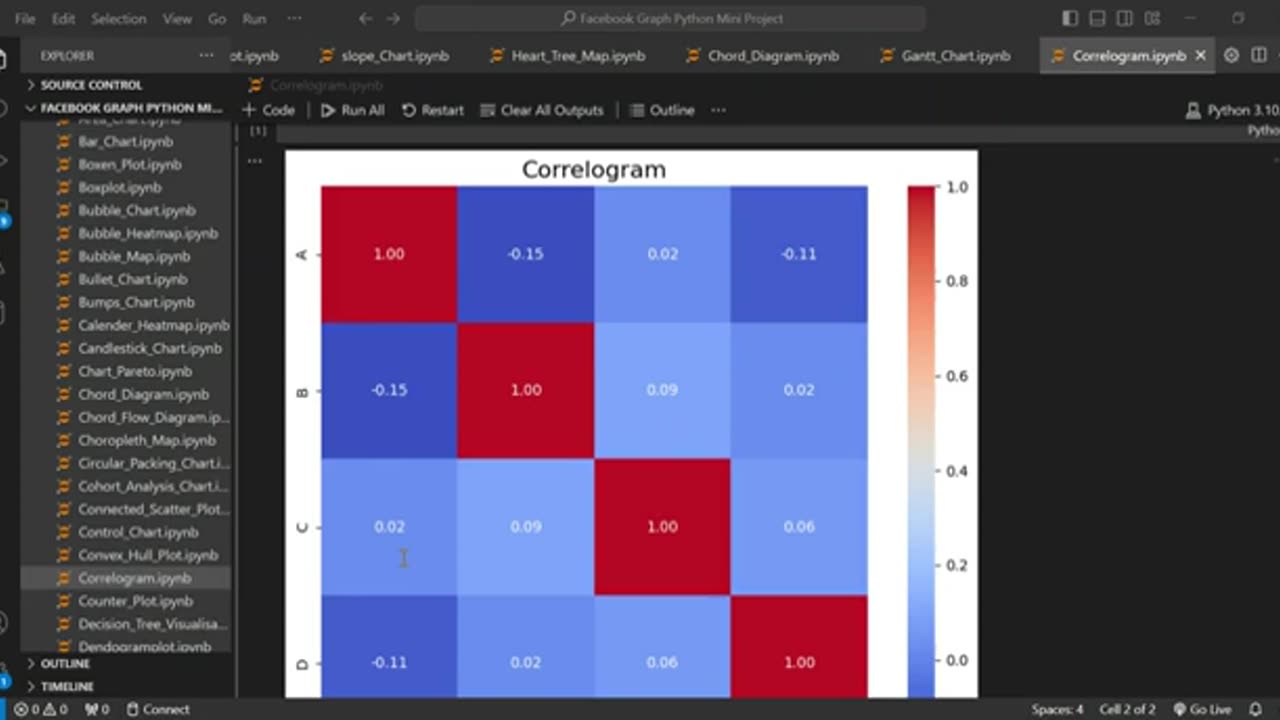
Learn how to visualize correlation matrices like a pro using Python! In this tutorial, I’ll walk you through creating a correlogram (correlation heatmap) with Seaborn, Matplotlib, and Pandas—perfect for data analysis, machine learning, and exploratory data visualization.
✅ What You’ll Learn:
✔ How to generate a correlation matrix from a Pandas DataFrame
✔ Creating a heatmap-style correlogram with Seaborn (sns.heatmap)
✔ Customizing annotations, colors, and labels for clarity
✔ Fixing common errors (e.g., plt.tight_layout(), formatting)
✔ Practical use cases in data science, finance, and AI
👍 Enjoyed this? LIKE, SUBSCRIBE, and hit the BELL for more Python tutorials!
#Python #DataVisualization #Seaborn #Correlogram #Heatmap
#DataScience #Pandas #Matplotlib #MachineLearning #Statistics
#PythonTutorial #ExploratoryDataAnalysis #EDA #DataAnalysis
#Coding #AI #DataViz #TechTutorial #LearnPython
-
 12:24
12:24
Tundra Tactical
7 hours ago $6.34 earnedThe SIG Roast to ND Them All
68.7K8 -
 1:02:31
BonginoReport
10 hours agoDeportations Keep “Frightened” Michelle Obama Awake at Night (Ep. 37) - Nightly Scroll with Hayley
159K194 -
 1:54:29
Adam Does Movies
2 days ago $3.30 earnedTalking Movie News & Just Chatting About Films - LIVE!
51.4K3 -
 1:02:51
Anthony Rogers
1 day agoEpisode 364 - JFK FILES
27.7K1 -
 1:41:02
megimu32
7 hours agoON THE SUBJECT: 1 Million Views Party! Diddy Drama, Marvel Weirdness, and Total Prom Chaos
37.7K16 -
 1:18:44
Kim Iversen
10 hours agoMagnetic Pole Shift: Europe’s Blackout Is Just the Beginning | 90° Earth Flip Coming
120K301 -
 2:44:58
Laura Loomer
9 hours agoEP118: LIVE COVERAGE: Trump Celebrates 100 Days In Office At Michigan Rally
79K38 -
 3:40:42
Barry Cunningham
16 hours agoWATCH TRUMP RALLY LIVE: PRESIDENT TRUMP MARKS 100 DAYS IN OFFICE WITH A RALLY IN MICHIGAN
57.7K23 -
 1:32:44
Badlands Media
16 hours agoBadlands Media Special Coverage: President Trump's 1st 100 Days Rally
68.9K4 -
 8:08:30
RalliedLIVE
11 hours ago $1.30 earnedWarzone All Night w/ Ral
22.3K4