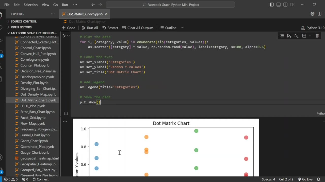
Create Stunning Dot Matrix Plots with Matplotlib 🎨📊✨
📊 Learn how to create professional Dot Matrix Plots using Python's Matplotlib! This step-by-step tutorial will teach you an innovative way to visualize category-based data that's more engaging than standard bar charts.
🔹 In this tutorial, you'll learn how to:
✅ Create a basic dot matrix plot from scratch
✅ Customize dot size, color, and transparency for better visualization
✅ Add proper labels, titles, and legends
✅ Use NumPy to generate random distributions
✅ Format your plot for professional presentations
🔔 Subscribe for more Python data visualization tutorials!
#Python #DataVisualization #Matplotlib #DotMatrixPlot
#DataScience #PythonTutorial #DataViz #PythonProgramming
#DataAnalysis #LearnPython #DataVisualizationTutorial
#MatplotlibTutorial #PythonForBeginners #TechTutorial
#AlternativeVisualizations #PythonCoding #DataPresentation
-
 LIVE
LIVE
VINCE
2 hours agoThe Mass Deportations Have Begun | Episode 31 - 04/28/25
59,968 watching -
 LIVE
LIVE
VSiNLive
43 minutes agoA Numbers Game with Gill Alexander | Hour 1
519 watching -
 UPCOMING
The Big Mig™
3 hours agoAutoPenGate Lock Em Up, Arrests Coming!
2493 -
 LIVE
LIVE
LFA TV
13 hours agoALL DAY LIVE STREAM - 4/28/25
2,281 watching -
 LIVE
LIVE
Rethinking the Dollar
21 minutes agoBlackout Spreads In Europe: Accident or WARNING? | Morning Check-In
61 watching -
 UPCOMING
Caleb Hammer
15 minutes agoFinancial Audit's Biggest Crashout
-
 LIVE
LIVE
Bannons War Room
2 months agoWarRoom Live
16,978 watching -
 LIVE
LIVE
Badlands Media
6 hours agoBadlands Daily: April 28, 2025
5,626 watching -
![🔴[LIVE] The Week Ahead, Breaking Market News & Live Trading || The MK Show](https://1a-1791.com/video/fww1/fd/s8/1/L/0/P/F/L0PFy.0kob-small-The-MK-Show-Apr.-28th.jpg) LIVE
LIVE
Matt Kohrs
12 hours ago🔴[LIVE] The Week Ahead, Breaking Market News & Live Trading || The MK Show
1,331 watching -
 LIVE
LIVE
Discover Crypto
1 hour ago$210K Bitcoin in 2025? (MAY IS the BIG Breakout)
152 watching