Create the Dot Density Map using Python 🗺️🐍
17 hours ago
6
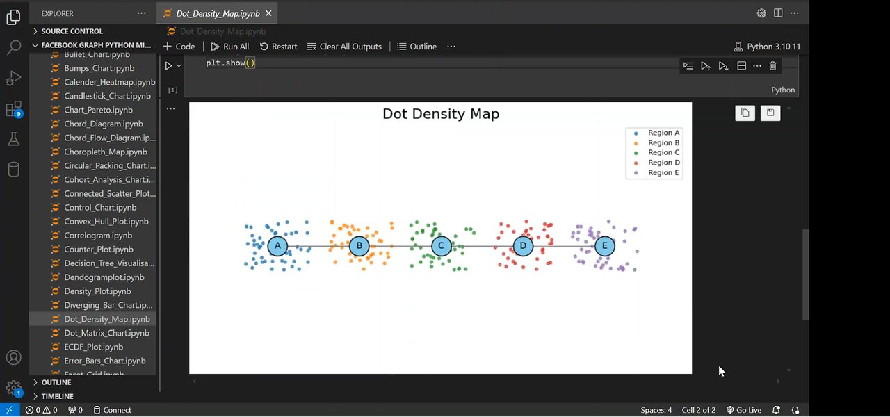
Dot density maps are a powerful way to visualize data distribution across different regions. In this step-by-step guide, we'll:
✅ Build a Network Graph using NetworkX
✅ Generate Random Dots to represent density in each region
✅ Customize the Visualization with colors, labels, and styling
✅ Combine Graph & Dot Density for an informative data representation
🔔 Subscribe for more Python & Data Science tutorials!
#Python #DataVisualization #NetworkX #Matplotlib #DotDensityMap
#PythonTutorial #DataScience #GraphTheory #PythonProgramming
#CodingTutorial #DataAnalysis #NetworkGraph #PythonForBeginners
#VisualizationTutorial #LearnPython #TechTutorial
Loading 1 comment...
-
 23:48
23:48
CatfishedOnline
15 hours agoVictim's Life is Threatened After He Gets in Too Deep With a Crypto Scammer
9231 -
 8:40
8:40
Shea Whitney
3 hours ago12 Fashion Mistakes Making You Look OLD & OUTDATED!
1.12K2 -
 29:18
29:18
TampaAerialMedia
4 hours ago $0.04 earnedUpdate SARASOTA, FL 2025 - St Armands, Lido, & Longboat Key
6781 -
 15:52
15:52
ARFCOM Reviews
20 hours ago $0.09 earnedNew Entry Level RDS | Primary Arms MD 21 GLx/SLx
9752 -
 44:55
44:55
BEK TV
17 hours agoUNDENIABLE PROOF: CHEMTRAILS, CHEMICAL FOG & USAID EXPOSED—THEY'RE POISONING US FROM ABOVE!
1.69K -
 36:59
36:59
Kyle Rittenhouse Presents: Tactically Inappropriate
1 hour agoThe Man Who Stared Down Putin: Tucker Carlson
914 -
 1:58
1:58
Memology 101
2 days ago $0.11 earnedJamie Raskin THREATENS retribution against Nayib Bukele & other WORLD LEADERS for working with Trump
1.44K12 -
 14:21
14:21
Chris From The 740
1 day ago $0.04 earnedBigger Red Dot, Better Performance? Cyelee Bull Pro Tested!
491 -
 1:31:58
Game On!
20 hours ago $6.98 earnedIt was ALWAYS a Shedeur thing! NFL Draft Day 2 Reaction!
24.8K1 -
 39:38
39:38
CharLee Simons Presents Do Not Talk
3 days agoFREEDOM TO CHOOSE - Sam Anthony & Scotty Saks
3.29K1