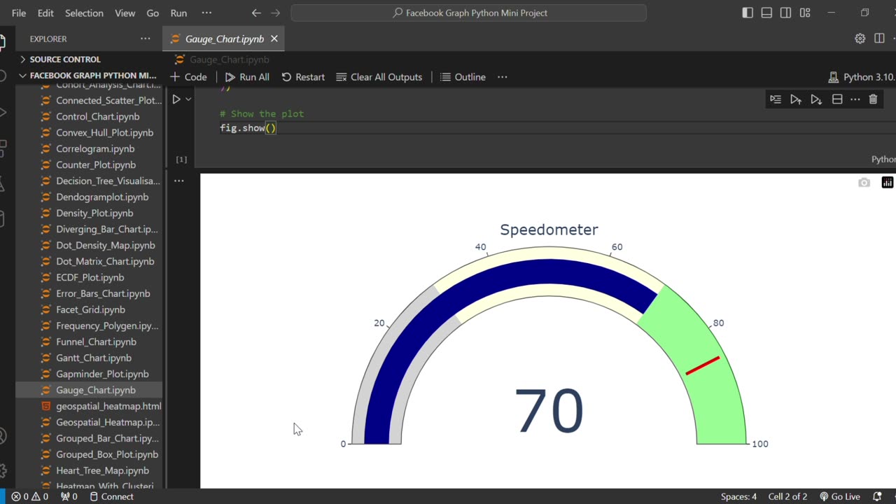
Create a Speedometer Gauge Chart in Python Using Plotly 📊🐍
#Python #Plotly #DataVisualization
Want to visualize your data in a more interactive and engaging way? In this video, you'll learn how to create a Speedometer-style Gauge Chart using Plotly in Python – step-by-step!
We’ll cover: ✅ Creating a gauge chart using plotly.graph_objects
✅ Customizing color zones (gray, yellow, green)
✅ Adding threshold indicators
✅ Making your charts look clean and professional
This tutorial is perfect for beginners and data visualization enthusiasts looking to build modern dashboards and indicators in Python.
🔔 Don’t forget to Like, Comment, and Subscribe for more Python & Data Visualization tutorials!
#Python #Plotly #DataVisualization #Dashboard #GaugeChart #PythonTutorial #Python #Plotly #DataVisualization #GaugeChart
#SpeedometerChart #PythonDashboard #PythonPlotly #PlotlyTutorial
#PythonBeginner #PlotlyIndicator #PythonDataScience #PythonVisualization #CreateGaugeChart #PythonGraph
#DashboardInPython
-
 15:53
15:53
The Connect: With Johnny Mitchell
13 hours ago $6.86 earnedThe Truth About Ross Ulbricht & The Silk Road: How One Man Became The Internet's BIGGEST Drug Dealer
39.2K9 -
 22:53
22:53
The Brett Cooper Show
2 days ago $9.34 earnedThe Rise of Fake Gurus & Online Cults | Episode 23
45.4K29 -
 14:59:18
Total Horse Channel
17 hours agoWinnemucca Spring Spectacular Cow Horse Show and Derby - Saturday
46.2K5 -
 LIVE
LIVE
After Work Gaming
6 hours ago $1.34 earned“🍺 SOJU SATURDAY “🍺 THE FINALS SEASON 6
144 watching -
 19:01
19:01
Russell Brand
13 hours agoTheo Von Just SHOCKED EVERYBODY With His Take on Trump Tariffs
94K107 -
 14:22
14:22
Tundra Tactical
7 hours ago $5.07 earnedTRUMP DOJ Decides CZ Scorpion Is A Decepticon.
43.3K14 -
 4:53:37
Culturama Podcast
5 hours ago $3.62 earnedEaster Special! Hollow Knight Stream!
33.3K4 -
 1:04:29
Sarah Westall
8 hours agoThe Philippines and Massive Stores of Gold for all the People of the World w/ Joseph Allain
57.1K43 -
 17:23
17:23
Exploring With Nug
17 hours ago $7.36 earnedCorvette Found Underwater! Continuing The Search For Laresha Walker!
50K2 -
 3:06:31
Damysus Gaming
5 hours agoWeaving into the Deep South: South of Midnight First Play! Part 2
10.6K2