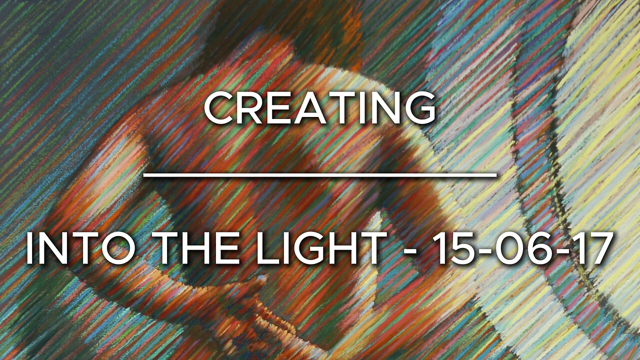
Creating Into the light - 15-06-17
Website link: https://corneakkers.com/into-the-light-15-06-17/
Printable: https://corneakkers.com/product/printable-into-the-light-15-06-17/
Darkness and Light
This pastel drawing ‘Into the Light – 15-06-17’ is something different from what I have done before. Basically, it all boils down to a question: Enter the gloom or into the light? I wanted to delve into the darkness and bring a woman back into the light. With a little help from my friend Look J. Boden for the excellent photography and the top class model that stood for us.
Color Approach
The model actually is a good friend of mine and I was inspired by the picture to turn it into a special pastel drawing. The method of divisionism was back on the menu. Through the placement of consecutive red and green strokes I got the desired greyish effect such complementary colors induce. The effect is different from up close and from a distance. Therefor the specactor can enjoy the artwork differently. When you step back it all converges into the right image.
Gloom
Not for nothing did I use the word ‘gloom’ because I rather liked the dark fantasy the picture implied. It depicts almost a bad schoolgirl with only her stockings on, put in the corner. Of course, besides all color theories ad described above, it is all about the tonal range in this pastel. The tonal rhythym from left to right is what causes the plasticity of the scene and therefor brings forth the penetrating impression.
Later Variations
After this pastel I abstracted it in my roundism style through a graphite pencil drawing Roundism -04-07-17 that on itself became the prestudy for an oil painting 11-02-18.
Pastel drawing on Canson Mi-Teintes Touch paper (50 x 70 x 0.1 cm)
Artist: Corné Akkers
-
 LIVE
LIVE
Wendy Bell Radio
6 hours agoLONG LIVE THE KING
12,326 watching -
 1:27:55
Game On!
17 hours ago $4.36 earnedThe BIGGEST Hockey Match of the Century: USA vs Canada!
47.1K6 -
 17:20
17:20
Bearing
2 hours agoElon Musk's Baby Mama Drama 😧 Did he Stick it in CRAZY??
6.73K6 -
 LIVE
LIVE
2 MIKES LIVE
2 hours agoTHE MIKE SCHWARTZ SHOW with DR. MICHAEL J SCHWARTZ 02-20-2025
232 watching -
 10:33
10:33
ThinkStory
19 hours agoCOMPANION Ending Explained!
62.9K4 -
 19:59
19:59
Neil McCoy-Ward
20 hours ago🇺🇸 $5,128.21 DOGE Stimulus Check Refund?! Here’s What You Need to Know!
46.6K25 -
 29:22
29:22
Degenerate Jay
23 hours ago $3.94 earnedIs Captain America: Brave New World That Bad? - Movie Review
41.3K5 -
 2:35
2:35
Mrgunsngear
21 hours ago $4.74 earnedFrying Pan As Improvised Body Armor?
63.2K27 -
 9:07
9:07
Silver Dragons
20 hours agoThis GOLD REVALUATION Will Change Everything
57.7K15 -
 9:16
9:16
MudandMunitions
21 hours agoGriffin Armament 3x Prism Optic Unboxing and First Impressions! The Ultimate Tactical Upgrade
47.1K2