Mastering the Pie chart with Python Matplotlib | Py for PYTHON
Welcome to Py for PYTHON! 🎉 Dive deep into Python with tutorials that cater to all skill levels, from beginners to pros. Our channel covers many topics, including Data Science, Data Visualization, Python automation, Animations, and more.
Unlock the full potential of pie charts with Python's Matplotlib library in this comprehensive tutorial brought to you by Py for PYTHON! Whether you're just starting out or looking to refine your skills, this video covers everything you need to know to create stunning pie charts for your data visualization needs.
Introduction to Pie Charts
We start with an introductory segment on pie charts, discussing their significance and various applications in visually representing data. You'll gain insights into the history of pie charts, their advantages and limitations, and when to use them effectively.
Getting Started with Matplotlib
After covering the basics, we move on to setting up your environment and installing Matplotlib if you haven't already. We guide you through importing the necessary libraries and setting up your first pie chart with basic parameters.
Basic Pie Chart Creation
Adding Titles and Labels: Learn how to add informative titles and labels to your pie chart to make it more understandable.
Pie Chart Slices: Understand how to create and adjust slices, including how to highlight specific slices for emphasis.
Grid Lines and Legends: Discover how to add grid lines and legends to improve the clarity and readability of your pie chart.
Customization Techniques
Venturing into customization, we'll explore:
Color Maps and Color Bars: Dive into color maps and color bars to add vibrant and meaningful color schemes to your visualizations.
Matplotlib Built-in Styles: Explore Matplotlib's built-in styles to quickly apply a professional look to your charts.
Full Customization: Learn how to fully customize every aspect of your pie chart, from slice colors to fonts and sizes.
Working with Data
Data from Excel Files: We'll walk you through importing data from Excel files, ensuring you can efficiently manage large datasets.
Manually Inputting Data: We demonstrate how to manually input data into pie charts for those working with smaller datasets or custom inputs.
Pie Chart Comparisons
Enhance your analytical skills by comparing different pie charts. We'll create multiple pie charts and place them side by side to highlight differences, similarities, and unique data points.
Advanced Techniques
For more advanced users, we delve into:
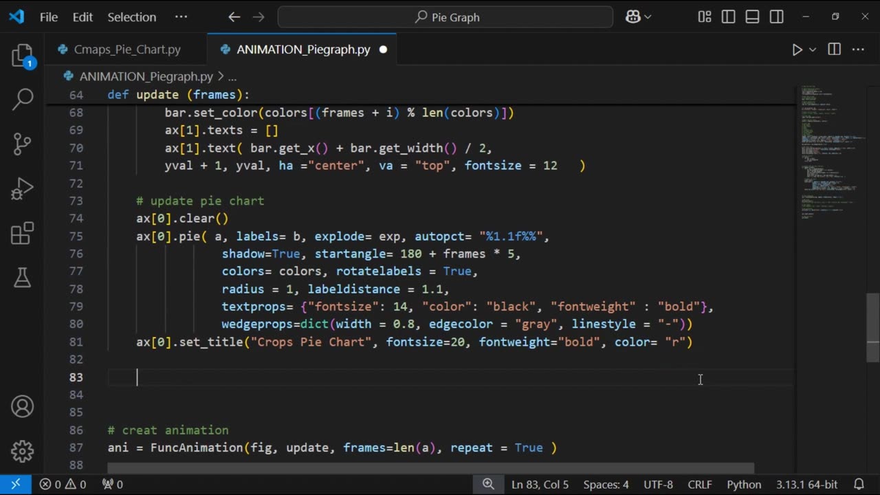
Pie Chart Animations: Learn how to animate your pie charts to make your presentations more dynamic and engaging.
Animating Color Bars: Start by animating just the color bars for a subtle yet effective visual enhancement.
Full Pie Chart Animations: Move on to animating both the pie chart and color bars, and finally, animate the pie chart alone for a professional flair.
Professional Customization: Fine-tune your animations to achieve a polished, professional look by customizing every aspect of the animation.
Saving Your Work
Saving as Images, PDFs, GIFs, and Videos: Master the art of saving your pie charts in various formats, including images, PDFs (using PdfPages), GIFs (with PillowWriter), and videos (via FFMpegWriter). This section ensures you can share and present your visualizations effectively.
Adjusting Animation Speed and Length
Finally, we'll teach you how to control the speed and duration of your animations. By the end of this tutorial, you'll be able to create animations that are not only visually appealing but also perfectly timed for your specific needs.
Conclusion
This video is packed with valuable content designed to help you master pie charts using Python's Matplotlib library. By following along, you'll acquire the skills needed to create, customize, and animate pie charts like a pro. Whether you're working on a personal project, a professional presentation, or a data analysis task, this tutorial has got you covered.
-
 1:37:17
Badlands Media
6 hours agoBaseless Conspiracies Ep. 128: The Accelerationist Cults Grooming Kids into Terrorism with BX
93.5K29 -
 2:44:29
TimcastIRL
7 hours agoBail DENIED For Leftist Who FIREBOMED Democrat Governor's Mansion, Mangione Effect | Timcast IRL
193K88 -
 24:05
24:05
Glenn Greenwald
12 hours agoAs U.S. Censorship Escalates, New Poll Reveals Declining Support for Israel: UNLOCKED Episode
147K121 -
 2:14:50
We Like Shooting
1 day ago $8.28 earnedWe Like Shooting 606 (Gun Podcast)
43.5K4 -
 1:00:41
Donald Trump Jr.
13 hours agoMake Main St Great Again, Interviews with Alex Marlow & John Phillips | TRIGGERED Ep.233
176K54 -
 1:45:23
megimu32
9 hours agoON THE SUBJECT: 2008 Called.. It Wants Its Chaos Back!
56.8K20 -
 1:01:53
BonginoReport
11 hours agoPolitical Violence on the Rise in America - Nightly Scroll w/Hayley Caronia (Ep.26) - 04/14/2025
154K97 -
 1:32:42
BlackDiamondGunsandGear
5 hours agoThey Don’t want you to Purchase 2A Related Products?
38.2K3 -
 2:53:36
Joe Pags
9 hours agoThe Joe Pags Show 4-14-25
98.2K -
 56:14
56:14
Sarah Westall
9 hours agoGlobal Agenda: Starve Small Business of Funds w/ Bruce De Torres
84.2K22