Premium Only Content

NASA's Garbage Patch Visualization Experiment
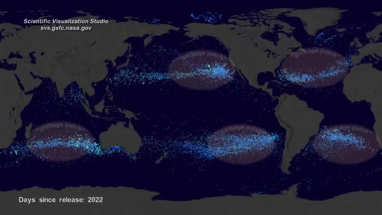
NASA created a visualization of the ocean garbage patches using data from floating, scientific buoys that NOAA has been distributing in the oceans for the last 35-years.
Video Credit: NASA's Scientific Visualization Studio
Complete transcript:
Hi, it’s Greg Shirah from NASA’s Scientific Visualization Studio. We wanted to see if we could visualize the so-called ocean garbage patches. We start with data from floating, scientific buoys that NOAA has been distributing in the oceans for the last 35-years represented here as white dots. Let's speed up time to see where the buoys go... Since new buoys are continually released, it's hard to tell where older buoys move to. Let's clear the map and add the starting locations of all the buoys… Interesting patterns appear all over the place. Lines of buoys are due to ships and planes that released buoys periodically.If we let all of the buoys go at the same time, we can observe buoy migration patterns. The number of buoys decreases because some buoys don't last as long as others. The buoys migrate to 5 known gyres also called ocean garbage patches. We can also see this in a computational model of ocean currents called ECCO-2.We release particles evenly around the world and let the modeled currents carry the particles. The particles from the model also migrate to the garbage patches. Even though the retimed buoys and modeled particles did not react to currents at the same times, the fact that the data tend to accumulate in the same regions show how robust the result is.
-
 54:28
54:28
LFA TV
1 day agoUnjust Man | TRUMPET DAILY 2.27.25 7PM
19.7K2 -
 20:10
20:10
CartierFamily
8 hours agoAndrew Schulz DESTROYS Charlamagne’s WOKE Meltdown on DOGE & Elon Musk!
36.8K46 -
 1:36:39
Redacted News
5 hours agoBOMBSHELL EPSTEIN SH*T SHOW JUST DROPPED ON WASHINGTON, WHAT IS THIS? | Redacted w Clayton Morris
145K251 -
 2:03:31
Revenge of the Cis
7 hours agoEpisode 1453: Fat & Fit
48.6K8 -
 2:38:12
The White House
8 hours agoPresident Trump Holds a Press Conference with Prime Minister Keir Starmer of the United Kingdom
160K61 -
 1:01:04
In The Litter Box w/ Jewels & Catturd
1 day agoDrain the Swamp! | In the Litter Box w/ Jewels & Catturd – Ep. 751 – 2/27/2025
91.7K37 -
 1:11:24
Dr. Drew
8 hours agoNEW: Cardiac Arrest In Healthy Young People After mRNA w/ Nicolas Hulscher – Ask Dr. Drew
72.7K38 -
 4:24:53
Right Side Broadcasting Network
12 hours agoLIVE REPLAY: President Trump and UK Prime Minister Starmer Meet and Hold a Press Conference 2/27/25
166K47 -
 2:12:33
Adam Carolla
2 days agoKamala Harris vs. Trump Wildfire Response + Jillian Michaels on Motherhood/Ayahuasca & Sperm Donors!
57.1K21 -
 4:18:28
Barry Cunningham
11 hours agoTRUMP DAILY BRIEFING: PRESIDENT TRUMP AND UK PRIME MINISTER STARMER HOLD PRESS CONFERENCE!
78.7K16