Premium Only Content

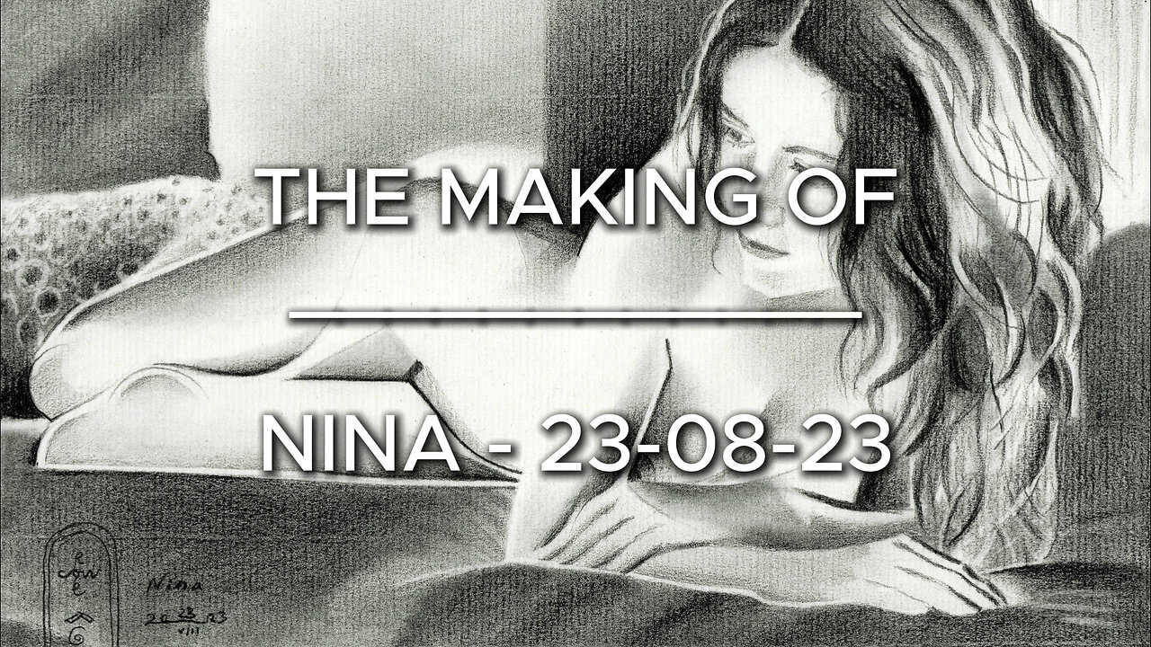
The Making of Nina – 23-08-23
Website link: https://corneakkers.com/nina-23-08-23/
Printable: https://corneakkers.com/product/printable-nina-23-08-23/
Beautifully Arranged
This graphite pencil drawing ‘Nina – 23-08-23’ already is the third I made of this gorgeous lady. What’s next I asked myself? Whereas last drawing showed her in her metallic beauty I was not sure whether I should do a similar one. I have a bunch of reference pictures, also one on which she reclines on a bed. That one caught my attention even though it showed a lot of soft tones. However, the composition was beautifully arranged and her bodily features seem to underlign just that. I found soft flowing curves but also detected hard linear and edgy structures studying it in more detail. Enough to stimulate my artistic fantasy.
Minimalistically
Soon I got the proportions right so I had some extra time to ponder over cubist styling. Implementation of solarisational levels also came to mind. You see, due to the backlighting her body seemed to flow over into the negative space. It made the photographic scenery simply too light. Solarization came to my aid and I didn’t even need to apply a hefty tonal play. I didn’t want to loose the styled legs and abdomen too much. Minimalistically I already liked them and I made sure I left some areas open. This way they would communicate with the space around them.
Polka Dots
There were two pillows near her feet at the left and also a floor lamp near her shoulder. I skipped the latter. The folds in the lampshade would have competed too much with the lush and volumneus hair. The lower pillow was polka-dotted. On a whim in the end I decided to slighty indicated those dots. Through that I got some contrast with the rather opaque looking planes throughtout the depiction.
Balancing out Contrasts
The overall goal often gets revealed in the end. This is what I always tell students. There is no true intention than to play and fool around. See what you may get. Maybe it is that I learnt to be patient and listen to my inner voice. That’s not a rational way of listening but a subconsciousness process, whilst playing that is. All in all the piece makes perfectly sense to me now. There are detailly structures in the middle, to the left and the right. There are contrasts in light and dark, different levels of abstraction. I even am suprized of the fact the limbs look very abstract but credible and convincing. I realize that’s partially caused my the more realistic features in her face. Do you concur?
Graphite pencil (Faber Castell Pitt Graphite Matt pencil 14B) drawing on Fabriano Ingres paper (21 x 28.2 x 0.1 cm)
Artist: Corné Akkers
-
 26:47
26:47
Degenerate Plays
12 hours ago $0.49 earnedBatman Ended This Man's Whole Career - Gotham Knights : Part 46
9.22K2 -
 36:26
36:26
The Screwtape Letters: Confronting Evil in Our Time - Podcast
11 days agoStage 4 to Cancer Free - The Miracle Patient Interview with Dan Thompson
7.2K2 -
 30:10
30:10
Afshin Rattansi's Going Underground
2 days agoTariq Ali: Donald Trump’s War Threats Against Iran🇮🇷 is Really About Targeting China🇨🇳
61.6K62 -
 2:45:19
TimcastIRL
12 hours agoTrump THREATENS 50% Tariff Increase After Market CHAOS, Tells China BACK OFF
275K120 -
 1:56:17
Badlands Media
18 hours agoBaseless Conspiracies Ep. 127: The Satanic Fed Op Behind 764, Pedo Networks & Psychological Warfare with Special Guest, BK
96.7K60 -
 28:01
28:01
Side Scrollers Podcast
10 hours agoNEW SERIES! Smash JT Has a Full-On Meltdown | Nerd Duel ft. Lady Desiree & You, Me & The Movies
51.1K2 -
![🔴[LIVE] PVP and ATHENA | Sea of Thieves | Day 606/710 ~ Zen Premium Gaming - Daily Live Streams](https://1a-1791.com/video/fww1/c0/s8/1/x/t/i/A/xtiAy.0kob-small-LIVE-PVP-and-ATHENA-Sea-of-.jpg) 6:21:13
6:21:13
Zen Premium Gaming
7 hours ago $0.28 earned🔴[LIVE] PVP and ATHENA | Sea of Thieves | Day 606/710 ~ Zen Premium Gaming - Daily Live Streams
5.07K1 -
 1:05:32
Donald Trump Jr.
18 hours agoNews Not Noise, Live with Power the Future's Daniel Turner | TRIGGERED Ep.231
216K104 -
 6:34:17
IMICANIS
8 hours ago $0.16 earnedSuper Mario
4.52K1 -
 LIVE
LIVE
AndersonGaming
6 hours agoDoom Eternal - LIVE
29 watching