Premium Only Content

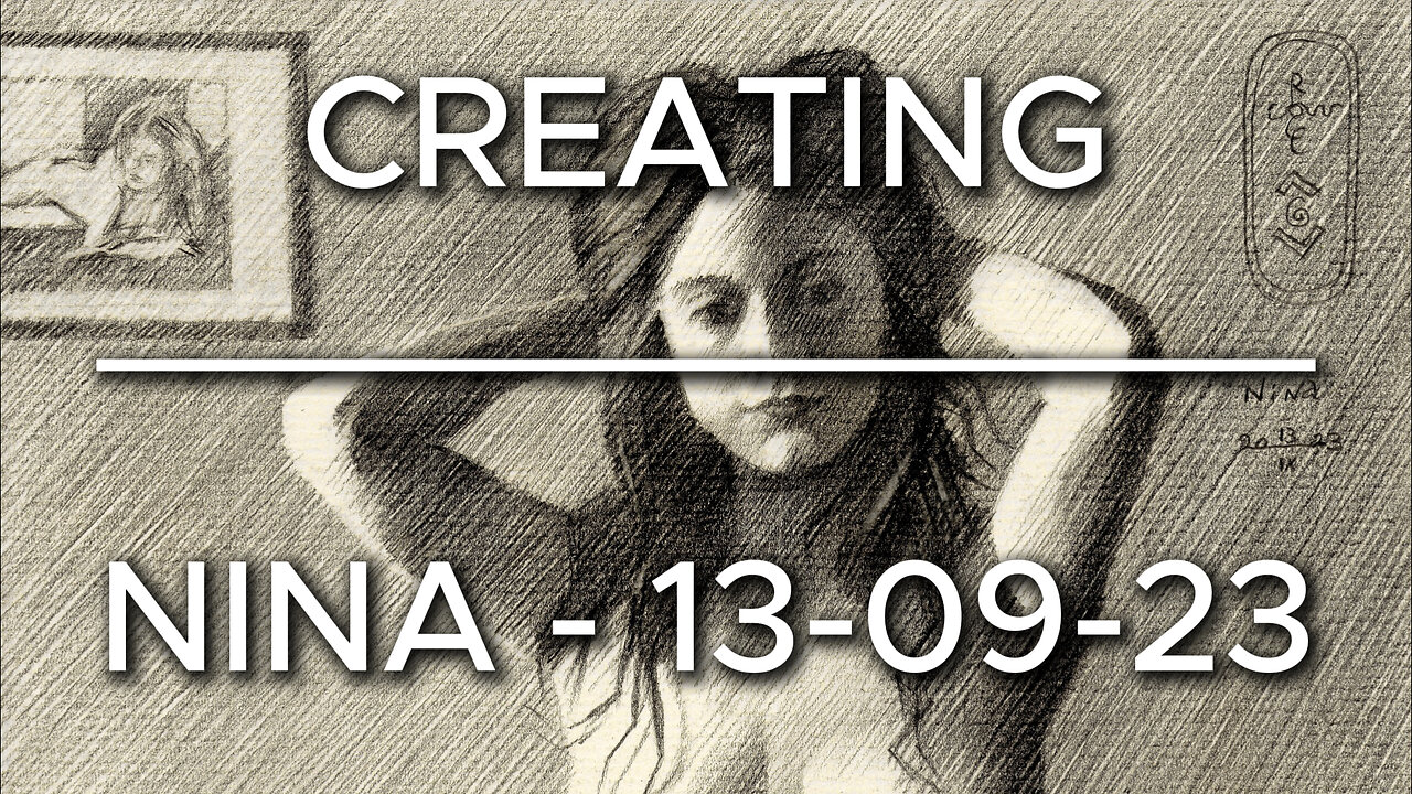
Creating Nina – 13-09-23
Website link: https://corneakkers.com/nina-13-09-23/
Printable: https://corneakkers.com/product/printable-nina-13-09-23/
Back to Hatch
This graphite pencil drawing ‘Nina – 13-09-23’ a return to black and white but also to the technique of hatching. Last Spring I did a couple of landscapes and I remember ‘Marlot – 27-03-23’ was also executed in hatched strokes. Strange how these different styles linger about in my head. Then all of a sudden and for no particular reason one takes the lead. Or does it? Perhaps my rationality matched my gut feel in this particular situation. I asked Nina if she had some photos with true chiaroscuro tonal distributions. She referred me to this beautiful picture and I guess I saw the potential of the lighting. It certainly would be a match for my hatching skills. You see, througout the years I found out this technique renders me most sutble tonal transitions. This having decided, what’s next on the menu?
Cubist Styling
Last one of Nina was in done in color. My ambition was to match realism to cubist styling inasmuch people would feel the cubist styling to be real. That lead me to a full array of emotions. 90% found the artwork great. However, there were some nit-pickers that thought I shouldn’t mix up these two styles. Others found the neck particularly bulged, looking like goiter. I don’t mind. Although I have to admit combining styles can lead to confusion. Lovely! I like that and now I know I’m really on to something. Hence, the incorporation of cubism once more in the drawing at hand. Not that much but slightly in order to keep viewers on their toes, catch them off guard. Personally, I think the subtle styling looks a bit similar to the one applied in ‘Julia – 11-09-18’.
Jan Veth
The hatched strokes were also motivated by something else when I come to think of it. In my previous art statement I mentioned Jan Veth and his works on display in the Dordrechts Museum. One particular pen drawing I remembered, called ‘Louw the Gardener’. Rarely have I seen such gossamer lines meticulasly drawn in inkt. You know, using pencil I simply can erase some lines and start anew. Using inkt there no room for error. Yet, he managed to put all strokes horizontally without noticeable flaws. Then I knew I must do my best even more. We’re speaking of an artist living in an era without daylight lamps and running water. There was no flushable toilet. Transportation sucked big time. So there it is, I have cold and warm water, all the light I need and internet. There are plenty reference pictures and ideas on my screen. Keep going!
Erwin Olaf
Setting out proportions and laying strokes came all very fine but as the drawing progressed something was missing. Just as with all smashing reference pictures taken by others, put in hunter words: it’s not my kill! So there it was, a void felt inside me that needed filling. In other words, I had to add something to the mix, putting my mark on the composition. Gradually I noticed I associated her and the couch with Erwin Olaf’s Hope series. That was all about women put in 60s and 70s settings. The pattern in the couch surely was conducive to that association. Last but not least I added a framed version of a previous drawing of her in the left uppercorner. The bakelite telephone is a direct reference to Erwin. All in all a bit of a double homage to two great artists.
Graphite pencil (Faber Castell Pitt Graphite Matt pencil 14B) drawing on Fabriano Ingres paper (21 x 28.2 x 0.1 cm)
Artist: Corné Akkers
-
 DVR
DVR
vivafrei
3 hours agoBernie Gets DESTROYED! Confirmation Hearings RECAP! D.C. Aviation Disaster & MORE!
43K48 -
 1:34:42
The Quartering
4 hours agoNew Crash Footage PROVES Whose At Fault, Air Traffic Control Exposed, RFK Blasted, AI Issues
107K33 -
 4:56:18
Right Side Broadcasting Network
1 day agoLIVE REPLAY: WH Press Secretary Holds Press Briefing 1/31/25
259K79 -
 LIVE
LIVE
Dr Disrespect
5 hours ago🔴LIVE - DR DISRESPECT - PUBG - WHAT WINNING LOOKS LIKE
4,338 watching -
 LIVE
LIVE
Twins Pod
16 hours agoThe Q Anon Shaman EXPOSES The Truth of J6! | Twins Pod - Episode 50 - The Q Shaman
3,315 watching -
 1:02:51
PMG
18 hours ago $0.68 earnedRFK, Immigration & DeepSeek
12.3K1 -
 LIVE
LIVE
Scammer Payback
2 hours agoCalling Scammers Live
372 watching -
 1:33:14
Simply Bitcoin
5 hours ago $2.69 earnedMicroStrategy PROVES You're Not BULLISH Enough On Bitcoin| EP 1172
61.2K4 -
 1:58:05
The Charlie Kirk Show
4 hours agoGetting Them All Confirmed + DEI in the Air | Smith, Means | 1.31.2025
140K37 -
 13:19
13:19
Misha Petrov
3 hours agoDISGUSTING! TikTok Leftists MOCK RFK Jr.’s Disorder While He EXPOSES Big Pharma
33.3K30