Premium Only Content

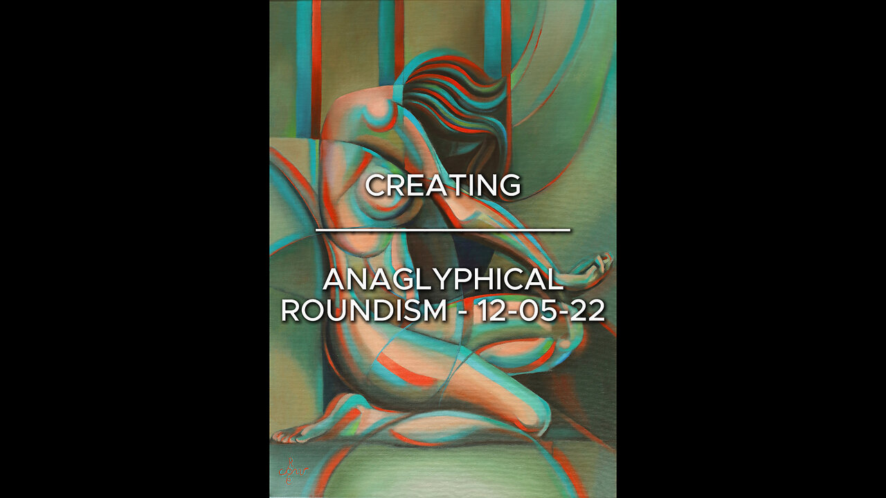
Creating Anaglyphical Roundism – 12-05-22
Website link: https://corneakkers.com/anaglyphical-roundism-12-05-22/
Printable: https://corneakkers.com/product/printable-anaglyphical-roundism-12-05-22/
Back in Style
This oil painting in the Roundism series is an elaboration of my graphite pencil drawing ‘Roundism - 25-12-17’. In my previous oils I used a luministic color scheme. However, this time I was up for something new. Rather than creating nifty pareidolia effects I wanted to delve into styling again or artistically speaking turn to formalism. Said drawing was perfect for this. I sold it quickly and I think it may be a winner in oil as well. I even didn’t have to change the composition. The drawing already said it all from a formalistic point of view.
Back in Black
In order to capture the exact forms I already caught in graphite I wanted to use so-called ‘dead paint’. So I thought. Right before the start I changed my mind. Somehow I thought it would be better to use Winsor & Newton’s Perylene black. It has a nice green-blueish shine to it. Perhaps subconsciously I associated the motif with art deco somehow. The dull green shine made me think of interiors from that era. We could consider then to appear old-fashioned, perhaps even corny. I like that!
Sucker for Beauty
Maybe I am just a sucker for old school things and therefor revel in retro styles. I certainly do not feel at ease in this current era. Craft seems to be ripped apart from artistic ambitions and it may be that I seek to restore the love for craft. The painting shows my love for stylistic elements invented by Jan Toorop (Delftsche Slaolie). I also could mention Alphonse Mucha, Tamara de Lempicka and so many others. They even may have induced the notion of a back to aesthetics feeling I have for so long now.
Added Color Value
Anyway, first capture forms and what’s next? Decide upon what colors to use. The green evoked the association with a phenomenon called anaglyph. You have to know I recently joined TikTok and especially the anaglypical logo caught my attention. I already was triggered by a profile picture of one of my students that was turned into an anaglyph. Both examples made me want to create an anaglyph myself, not through using an algorithm but through oil. Three days ago I thought it was finished. I only got the Perylene black and brighter red and greenish cyan strokes placed adjacent to eachother. It didn’t work though. It resembled something created by a computer algorithm. Besides that, it looked daftly coolish. I had to change around a lot and so I added pinks in the body mass. That did the job, whereas the anaglyphical effect still was present.
Credits
Finally I got to know who the photographer was of the initial reference drawing. My special thanks to Nickolas Muray who took a photo of dancer and choreographer Doris Humphrey back in 1922. I was right about the Art Deco-era. Long live 100 year old pictures!
Oil on linen (70 x 100 cm)
Framed (73,5 x 103,8 x 3,8 cm)
Artist: Corné Akkers
-
 52:21
52:21
The Rubin Report
1 hour ago‘Shark Tank’ Legend Notices Something About Trump’s Canada Plan No One Noticed
4.43K9 -
 LIVE
LIVE
Benny Johnson
1 hour agoPANIC: Massive Democrat Money Laundering Scandal EXPOSED, ActBlue in Collapse! Kash Criminal Charges
11,156 watching -
 LIVE
LIVE
Steven Crowder
3 hours ago🔴 USAID Shredding Conspiracy | What Everyone's Getting Wrong with Half Asian Lawyer Bill Richmond
38,779 watching -
 1:07:01
Timcast
2 hours agoTrump THREATENS MASSIVE 200% Tariff Against EU As GLOBAL Trade War IGNITES, China Hits Canada
39.7K43 -
 UPCOMING
Flyover Conservatives
11 hours agoNew Documentary Reveals Life-Threatening Corruption in the U.S. Government! - Matt Thayer; Michelle Obama & Gavin Newsom Enter the Podcast Game—But Why Now?| FOC Show
5.22K -
 LIVE
LIVE
LFA TV
15 hours agoCORNERED RATS RETALIATE! | LIVE FROM AMERICA 3.13.25 11AM
5,106 watching -
 48:29
48:29
BonginoReport
4 hours agoSatanists Dedicate Kansas Capitol to Satan (Ep.159) - 03/13/2025
95.9K134 -
 2:07:09
Matt Kohrs
14 hours agoBreaking Market News: Tariffs, Inflation & Gov'nt Shutdown || The MK Show
48.2K3 -
 2:59:43
Wendy Bell Radio
7 hours agoThe Schumer Shutdown
96.1K40 -
 19:19
19:19
Shea Whitney
2 hours ago $0.17 earnedI Drank *WATER ONLY* for 72 HOURS…Shocking Results!!!
3.5K