Premium Only Content

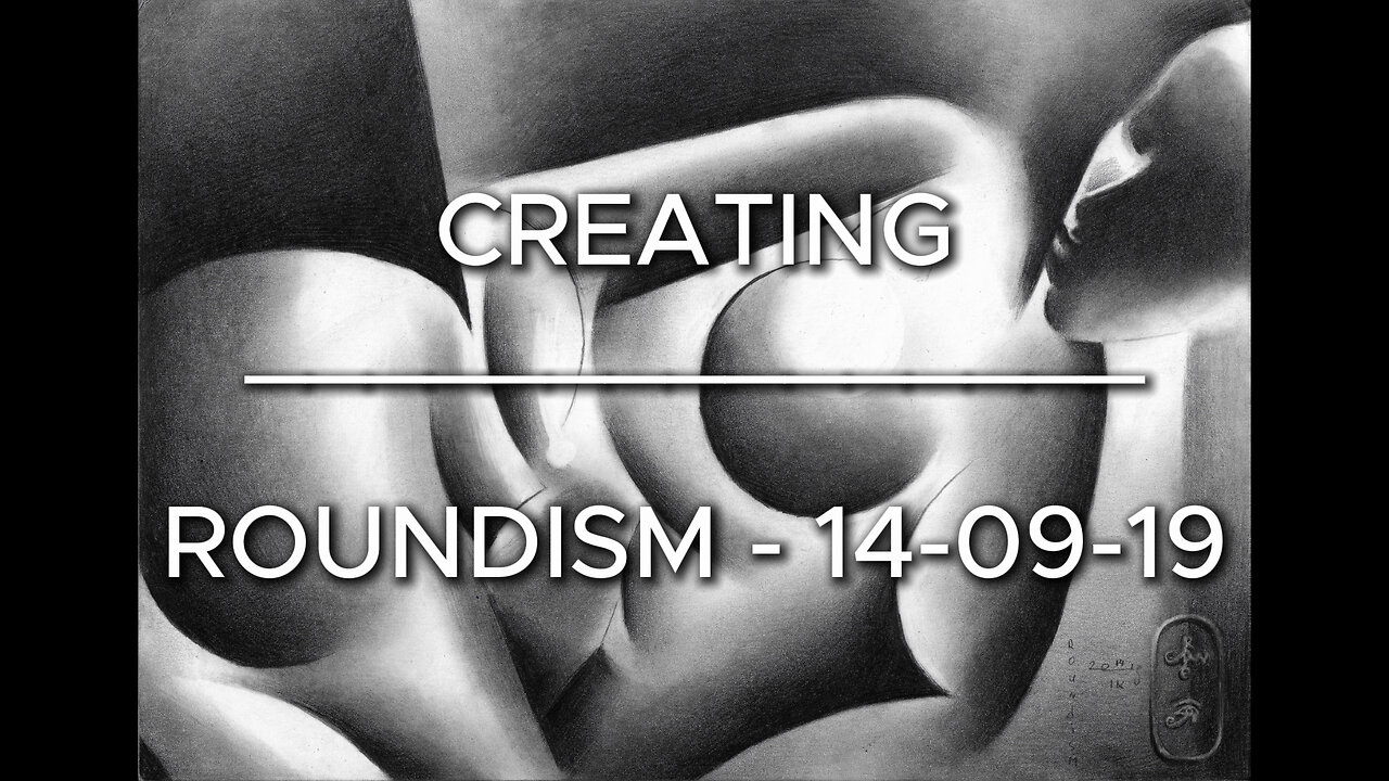
Creating Roundism – 14-09-19
Website link: https://corneakkers.com/roundism-14-09-19/
Printable: https://corneakkers.com/product/printable-roundism-14-09-19/
Inspirational sources
This graphite pencil drawing ‘Roundism – 14-09-19’ is a cubist but also slighty minimalistic one. Next to this, I added also a bit of surrealism. You know, Man Ray’s solarization was on my mind when I made this roundism drawing. Mondriaan also was because he strived for an ideal division of plain in a certain space. Besides that, I feel close to Tamara de Lempica’s conal body shapes. I like to combine them all and this is the result. I drew the face a bit realistic so the spectator would be tricked into believing the abstract bodily forms. It resulted in some criticism of people who found it detracting to the nice abstraction. However, I do not concurr. Personally I like the contrast very much. Besides that, it is not that realistic.
Straight versus Round
As explained in my description of the graphite pencil drawing ‘Roundism 24-10-19’ I often employ contrasts. That is, between light and dark primarily but also between round and straight. Even though my personal roundism style implicates round structures I find straight structures soothing to the eyes somehow. It removes the sharp edges of the massiveness of all combined round shapes. Therefor I like the diagonal sprouting from her lower left arm, running off paper. Makes want to draw some more in the future. My Roundism style needs some more eploration. What do you think of it so far?
Graphite pencil drawing (Pentel 0.5 mm, 3B) on Canson Bristol paper (21 x 29.7 x 0.1 cm) - A4 format)
-
 1:13:14
Michael Franzese
8 hours agoEmergency Livestream: Zelenskyy vs Trump, DOGE, Epstein Files, Elon Musk
85.3K63 -
 1:32:06
The Quartering
8 hours agoZelensky Comes CRAWLING BACK, Fed Ex Jet BURSTS Into Flames, Elon's Psycho Ex & More
117K136 -
 6:49
6:49
Russell Brand
1 day ago"HE'S A RUSSIAN PLANT!" CNN Loses It ON AIR!
181K228 -
 13:10
13:10
The Rubin Report
1 day agoWhy the Real Challenge Is Just Beginning | Jordan Peterson
111K29 -
 1:02:55
Tactical Advisor
10 hours agoBuilding a Truck Gun -Battle Hawk Build of the Month | Vault Room Live Stream 017
89.1K4 -
 42:41
42:41
Athlete & Artist Show
9 hours ago $3.45 earnedSeason 5 Episode 3 LIVE
67.6K3 -
 3:25:14
I_Came_With_Fire_Podcast
17 hours agoThe US GOVERNMENT is PLANNING a UAP FALSE FLAG ATTACK
53.9K16 -
 18:10
18:10
Sideserf Cake Studio
11 hours ago $1.95 earnedIs This the ULTIMATE Cake Smashing Moment?
51.8K3 -
 12:51
12:51
Misha Petrov
1 day agoTrump KICKS OUT Zelenskyy After HEATED White House Meeting!
47.7K101 -
 16:39
16:39
Tactical Considerations
1 day ago $1.65 earnedWatchtower Apache Double Stack 1911 Made Me Question Everything?
34.8K2