Text Manipulation_ Creating Attractive Typography
"Text Manipulation: Creating Attractive Typography"
Text manipulation is an art form that extends beyond mere words on a page, encompassing the visual appeal and design of typography. When crafting attractive typography, it's about more than just conveying a message—it's about creating an aesthetic experience. Here's a glimpse into the world of text manipulation and how to produce typography that captivates:
1. **Font Selection:**
The choice of font sets the tone for your typography. Whether it's a classic serif, a modern sans-serif, or a decorative script, selecting the right font aligns with the overall design theme and communicates the intended mood.
2. **Hierarchy and Emphasis:**
Establish a hierarchy within your text to guide the viewer's eye. Use variations in font size, weight, and style to emphasize key elements and create visual interest.
3. **Contrast for Impact:**
Utilize contrast effectively to make your typography stand out. This includes playing with contrasts in color, size, and style to create a dynamic and visually appealing composition.
4. **Kerning and Letter Spacing:**
Pay attention to the spacing between letters (kerning) and words. Adjusting these elements ensures optimal readability and contributes to the overall visual harmony of your typography.
5. **Consistency Across Elements:**
Maintain consistency in typography across different elements of your design. This includes headings, subheadings, body text, and any additional text elements. Consistency enhances cohesiveness and readability.
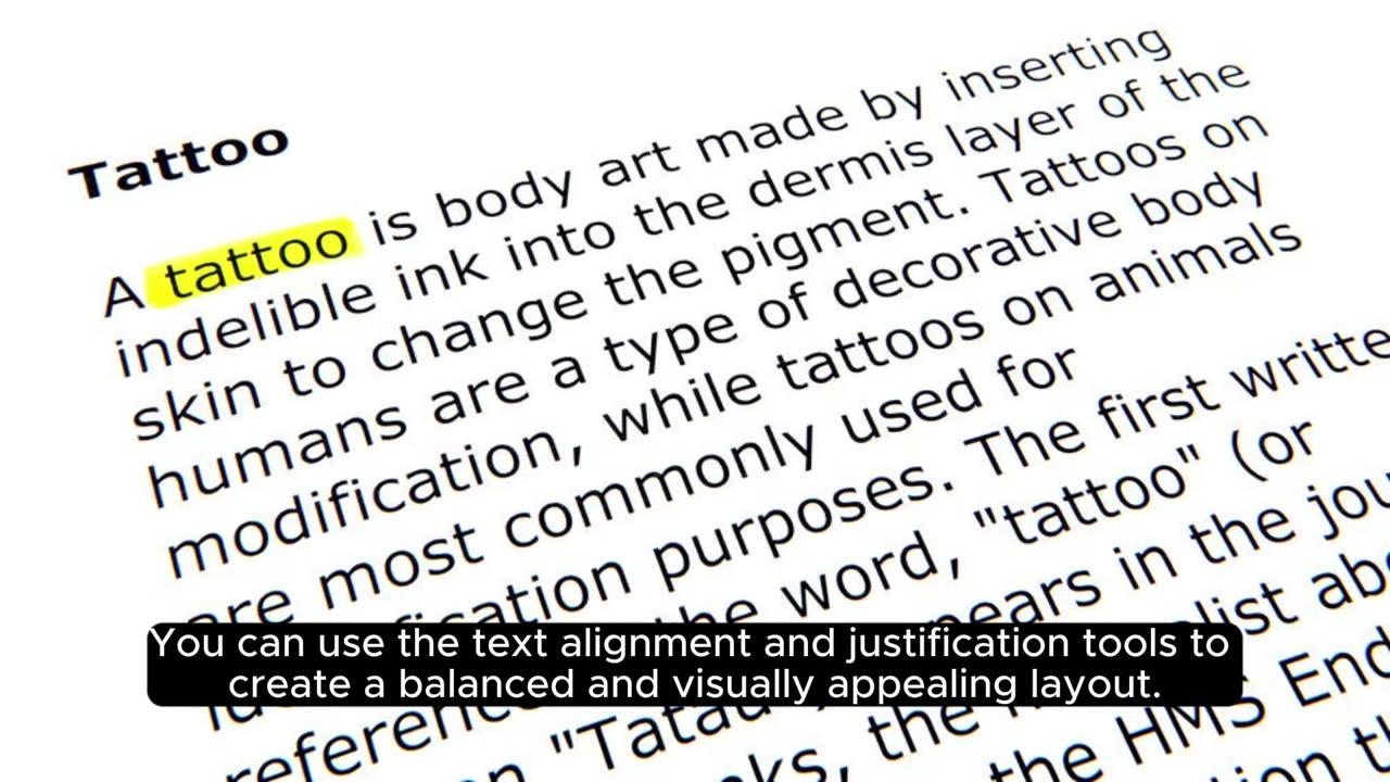
6. **Alignment and Grids:**
Align your text elements purposefully, and consider using a grid system for precision. Grids help maintain a structured layout and contribute to a polished and professional appearance.
7. **Color Psychology:**
Understand the psychology of color and its impact on the viewer. Choose colors that evoke the desired emotions or associations and ensure they complement the overall design scheme.
8. **Texture and Effects:**
Experiment with texture and effects to add depth to your typography. This could involve subtle gradients, shadows, or even textures applied to the text to create a tactile and visually engaging result.
9. **Legibility is Key:**
While aesthetics are crucial, never compromise on legibility. Ensure that your chosen typography remains readable across different devices and screen sizes.
10. **Experiment with Styles:**
Don't be afraid to experiment with different text styles, such as bold, italic, or underlined. These variations can be strategically applied to add emphasis and create a dynamic visual flow.
Text manipulation in typography is an intricate dance between form and function. By considering these elements and experimenting with various techniques, you can elevate your text from a conveyer of information to a visual masterpiece that captures attention and communicates with artistic flair.
-
 1:36:20
The Quartering
4 hours agoCybertruck Psyop? Fishy New Orleans Video & FBI BUSTED In Major Coverup!
31.6K26 -
Tucker Carlson
3 hours agoBernard Hudson: New Orleans Attack, Cybertruck Explosion, CIA Corruption, & Tusli Gabbard
93K104 -
 8:33
8:33
Chef Donny
2 hours agoWarm Up With Some Delicious Wild Rice Soup| Tasty Tailgating Ep. 16 Presented By Pepsi
2.52K3 -
 9:35
9:35
SLS - Street League Skateboarding
10 days agoHow Sora Shirai Won SLS Tokyo 2024 | Best Tricks
5.74K2 -
 LIVE
LIVE
GingerDonkey
3 hours agoThe DONKEY Barn is open for business
461 watching -
 40:12
40:12
jessedalba
17 hours ago $0.44 earnedRumble Movie:“Riding an Electric Harley 2,500 Miles to Sturgis… What Could Go Wrong?!”
7.45K7 -
 10:22
10:22
Dr Disrespect
3 days agoDR DISRESPECT - 2024 RECAP
50.7K78 -
 18:03
18:03
Neil McCoy-Ward
6 hours agoThe US 'INCIDENTS' Are just The Tip Of The Iceberg...
12.1K3 -
 1:33:19
Tactical Advisor
6 hours agoThe Vault Room Podcast 007 | Terrorist Attacks Update
46.3K3 -
 18:08
18:08
ROSE UNPLUGGED
23 hours agoAn Air of Optimism for 2025: Can You Feel It?
8.95K2