Premium Only Content

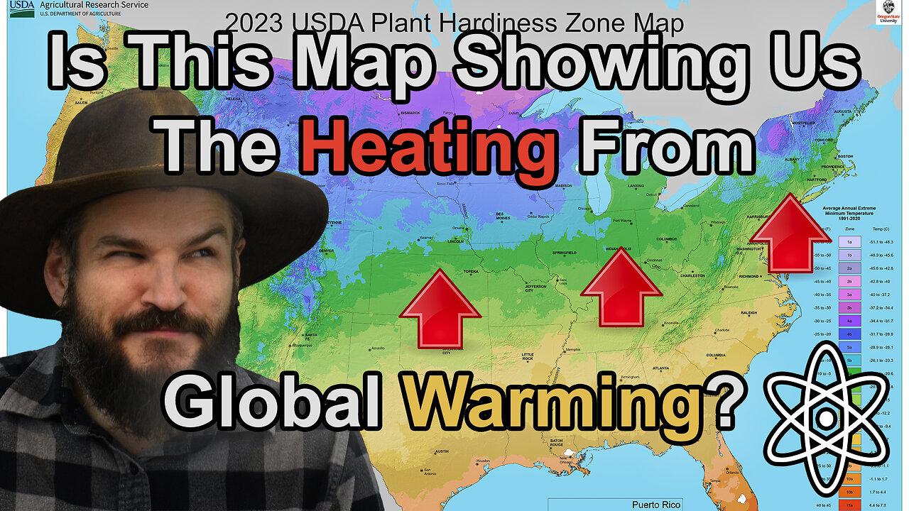
Why This New Map May Have Important Implications!|⚛
Why does this map have so many colors? It's because it's the new Hardiness Zone Map released by the USDA to help gardeners and more importantly farmers figure out where things are able to grow. What I think is even more interesting is how it's so different from the same map they released in 1992. Let me explain why!
#usdagrowingzones #hardinesszones #globalwarming
Background planet art is all my own unless otherwise stated.
✝=Religious Video
⚛=Science/Engineering Video
✝⚛=Both
Support me on Patreon:
https://www.patreon.com/daein
Engage me and others on discord:
https://discord.gg/hRpjUamzGj
Follow me on Twitter:
https://twitter.com/DaeinBallard
Follow me on Facebook:
https://www.facebook.com/DaeinExplains/
Follow me on Instagram:
https://www.instagram.com/daeinexplains/
-
 5:28
5:28
Daein Explains
2 months agoAdvent Is Not What Most People Think It Is.|✝
371 -
 2:16:49
TheSaltyCracker
10 hours agoMusk Destroys Gov't Money Pot ReeEEeE Stream 02-05-25
153K258 -
 1:10:59
FreshandFit
10 hours agoTop 3 Ways To Overcome A Break Up
108K11 -
 6:32:11
Akademiks
11 hours agoDrake Finally CUTS off FAKE FRIENDS in the Industry. VIOLATES KHALED, LEBRON! Announces album Feb14
88.1K11 -
 27:28
27:28
Glenn Greenwald
14 hours agoGlenn Reacts to Trump's Gaza Take Over: System Update Special
192K438 -
 2:13:49
Melonie Mac
11 hours agoGo Boom Live Ep 36!
104K11 -
 1:02:11
Sarah Westall
11 hours agoFreezing USAID & its Operations in Ukraine: A Massive Money Laundering Organization? w/ Sam Anthony
92.9K22 -
 2:05:35
Space Ice
15 hours agoSpace Ice & Redeye: Neil Breen's Pass Thru
41.3K2 -
 1:00:23
The StoneZONE with Roger Stone
11 hours agoRoger Stone Talks Trump’s Electric First 100 Day Agenda | The StoneZone w/ Roger Stone
45.6K9 -
 DVR
DVR
Redacted News
14 hours agoBREAKING! EPSTEIN LIST INCOMING UNDER AG PAM BONDI? DEMOCRATS FREAKING OUT, PRINCE ANDREW NERVOUS
196K308