Premium Only Content

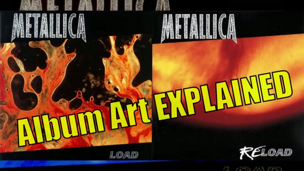
Metallica's Load & Reload Album Art EXPLAINED
SUBSCRIBE for MORE CONTENT: https://www.youtube.com/channel/UCyHeZUzOZJvLxPNV9_4__7g?sub_confirmation=1
JOIN our PATREON COMMUNITY: https://www.patreon.com/funfactsrock
SHOP for MERCH: https://pop-punk-radio.creator-spring.com/
DONATE to SUPPORT the CREATION of more CONTENT: https://www.paypal.com/paypalme/poppunkradio?country.x=US&locale.x=en_US
Have you ever looked at the album art for Metallica's Load or Reload albums and wondered what the heck it was supposed to be? Perhaps you were like me and assumed it was an abstract painting of a flame or maybe a lava lamp. Well, I'm afraid that the answer is something far more disgusting. In fact, the artwork isn't a painting at all.
The image was created by artist Andres Serrano who was creating a series of artistic photographs with bodily fluids. The image used for the cover of Metallica's Load was made by mixing bovine blood with... well... let's just say he mixed it with his own happy creamy feelings before he smashed the mixture between two sheets of glass and took a picture of it. And suddenly the title Load makes me feel much more uncomfortable. The image for Reload was created using the same bovine blood mixed with a yellow liquid, I'll let you guess what the yellow liquid is and where it came from.
Artist Andres Serrano spoke with Metal Hammer in 2022:
“It was Kirk and Lars who asked for the picture for Load. I met with them at Paula Cooper Gallery in New York, and we arranged for them to use the image for the album, merchandise and all promotional purposes. I was flattered and honoured they wanted it...
Because it spoke to them. They were drawn to it and I’m glad they were, because the image and album was a match made in Heaven...
It was part of a series called ‘Bodily Fluids’. They were photographs intended to look like paintings...
I bought it (bovine blood) at the butcher. It would be labelled ‘edible beef blood’ and I would buy a gallon of it whenever I needed it. The blood would darken after a day, so I thought I needed fresh blood to get the bright red. Later, someone told me to put the dark blood in a blender and it would brighten up again...
I think the images were a hit. I read a review once where the Load album was named No.1 on a list of best album covers. We know Lars and Kirk were happy with it but James was not. I think James is still fuming!” - Serrano, An Interview With The Artist Who Created Metallica's Load..., Eleanore Goodman, Metal Hammer (Sep 20, 2022)
Frontman James Hetfield was a tad uncomfortable with the artwork but he was a good sport and went along with the concept which had been picked out by guitarist Kirk Hammett after he discovered Serrano's work on the music video for "Crush My Soul" by Godflesh.
As Hetfield told Classic Rock magazine:
"The whole cover thing, it went against what I was feeling...
How can I put this? ... Lars and Kirk were very into abstract art, pretending they were gay. I think they knew it bugged me. It was a statement around all that. I love art, but not for the sake of shocking others. I think the cover of "Load" was just a p***-take around all that. I just went along with the make-up and all of this crazy, stupid s*** that they felt they needed to do." - Hetfield, Metallica's James Hetfield Explains Why Dave Mustaine "Had To Go", Classic Rock (Jul 2009), cataloged by Blabbermouth.net
In regards to using the same artist and concept for Reload, Hetfield had this to say:
"I hated it, but it had to match... It's matching hatred. I'm not a big fan of the man and his perversions. There's art and then there's just sick *mf-ers. And he's one of them. [Laughs] The thing is, they belong together. I don't care if the guy blows donkeys. The art had to match." - Hetfield, Five Things You Didn't Know About Reload, Jon Weiderhorn, Revolver (Nov 17, 2017)
-
 DVR
DVR
Slightly Offensive
5 hours ago $5.84 earnedDEEP STATE WINS?! Matt Gaetz OUSTED as AG & Russia ESCALATES War | Guest: The Lectern Guy
17.6K4 -
 LIVE
LIVE
Precision Rifle Network
5 hours agoS3E8 Guns & Grub - the craziness continues
147 watching -
 41:37
41:37
Kimberly Guilfoyle
6 hours agoPresident Trump Making all the Right Moves,Live with Border Union Chief Paul Perez & Lawyer Steve Baric | Ep. 176
94.1K22 -
 19:38
19:38
Neil McCoy-Ward
9 hours agoMASS LAYOFFS Have Started... (How To Protect Your Income)
13.8K5 -
 46:21
46:21
PMG
21 hours ago"Venezuelan Gang in 16 States, Animal Testing Crackdown, & Trump’s Nominee Battle"
6.97K3 -
 LIVE
LIVE
VOPUSARADIO
8 hours agoPOLITI-SHOCK! WW3!?, BREAKDOWN OF THE WORLD EVENTS & R.A.G.E. (What it means & What's next!)
92 watching -
 1:00:10
The StoneZONE with Roger Stone
6 hours agoWhy Democrats Hold Poor Children Hostage in Failing Schools | The StoneZONE w/ Roger Stone
34.9K3 -
 LIVE
LIVE
Tundra Gaming Live
6 hours ago $0.50 earnedThe Worlds Okayest War Thunder Stream//Air Force Vet Flys Jets
141 watching -
 2:00:54
Redacted News
7 hours agoBREAKING! Putin just SHOCKED the world, launches nuclear capable warheads "NATO can't stop it"
170K492 -
 55:37
55:37
Candace Show Podcast
7 hours agoMatt Gaetz Out, Jussie Smollett Walks Free! | Candace Ep 108
133K327