Premium Only Content

Introduction to color contrast and accessibility
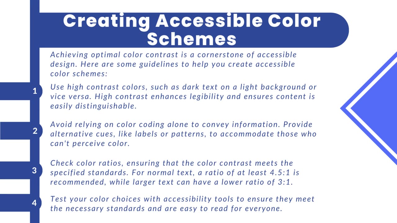
Color contrast is the differentiation in brightness or color between text and its background in digital content. It plays a vital role in design as it directly impacts the readability of text, especially for individuals with visual impairments or difficulties in perceiving colors. A higher color contrast enhances the legibility of text and graphics, while lower contrast can make content more challenging to interpret.
The Web Content Accessibility Guidelines (WCAG) are universally acknowledged standards for web accessibility that provide specific recommendations for color contrast. WCAG suggests a minimum contrast ratio between text and its background, often specified as a ratio like 4.5:1 for regular text and 3:1 for larger text. This guideline ensures that text remains easily distinguishable for people with limited vision, making it a critical factor in expanding the accessibility of digital content to a broader audience.
https://www.acadecraft.com/accessibility/color-contrast-and-accessibility/
-
 LIVE
LIVE
Redacted News
23 minutes agoSomething BIG is happening at Trump's Pentagon and it's not good for peace | Redacted News
5,843 watching -

The Quartering
3 hours agoWoke MELTDOWN As Trump Demands Repayment Of Student Loans, Austin Metcalf Dad Oblivion Greed,
75K38 -
 1:17:43
Awaken With JP
2 hours agoDid JD Vance Kill the Pope? - LIES Ep 88
25K11 -
 LIVE
LIVE
The HotSeat
52 minutes agoNo Consequences for Chaos: Tesla Gets Torched While Trump Makes Freeloaders Pay Up
413 watching -
 1:09:27
Russell Brand
4 hours agoGlobalism Is DEAD! WEF Leader Klaus Schwab RESIGNS “A Movement Is Bringing Down The System!” – SF570
116K106 -
![[Ep 655] Due Process for Who? | US Oil Dividend: Howe if Could Happen](https://1a-1791.com/video/fww1/ce/s8/1/L/Z/j/E/LZjEy.0kob-small-Ep-655-Due-Process-for-Who-.jpg) LIVE
LIVE
The Nunn Report - w/ Dan Nunn
48 minutes ago[Ep 655] Due Process for Who? | US Oil Dividend: Howe if Could Happen
125 watching -
 2:34:12
Right Side Broadcasting Network
5 hours agoLIVE REPLAY: Karoline Leavitt Holds a White House Press Briefing - 4/22/25
112K33 -
 9:36
9:36
Talk Nerdy Sports - The Ultimate Sports Betting Podcast
1 hour ago4/22/25 - Back-to-Back Sweeps?! Vasil’s Solo Kill Card for NBA, MLB, & NHL
3.01K2 -
 1:30:39
Simply Bitcoin
4 hours ago $3.52 earnedFED INSIDER Caught on HIDDEN Camera! (Fed Sabotages Bitcoin Bull Run?) | EP 1228
15.5K1 -
 48:16
48:16
Sean Unpaved
4 hours agoDraft Deals, Luka Takes, and Playoff Heat: NFL, NBA, & NHL Ignited
38.2K2