Premium Only Content

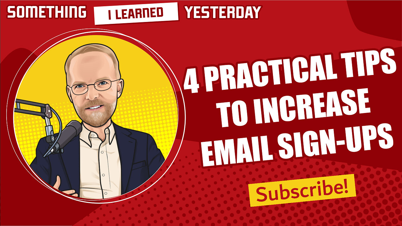
4 tips for your email sign-up page and process
Avoid these all-too-common mistakes with your e-newsletter sign-up
Email is becoming more and more important to publishing companies as search traffic gets scarcer. And I predict it’s only going to get worse.
Also, email is your own thing. You own it. You’re not dependent on any platforms – and that’s the right place to be. You don’t want to be at the mercy of somebody else’s algorithms if you can avoid it.
So let’s talk about your e-newsletter sign-up form.
Make it pop
Does your sign-up form look like part of the landscape? You know, there’s a logo here, and a banner ad there, and mixed in with all the boilerplate website junk is your email sign-up form. Has it become one of those things people ignore by habit – like an ad?
You don’t want to make it flashing, rotating, hot pink, but think of ways to make it pop and not just blend in with the furniture.
Put it above the fold, of course
Use an eye-catching design with contrasting colors, and a creative graphic, if you can
Make it work on mobile
Make it compelling
How are you selling it? Most people have very little interest in getting yet another newsletter. You have to catch their attention and make it worthwhile for them to get yet one more.
Use a compelling, benefit-oriented headline, and change it from time to time
Have a very clear call to action, and don’t use “submit.” Make it benefit oriented, like “get weekly updates.”
Add a freebie if you can. A special report download.
Make it easy
Don’t use too many fields. If you have to collect more than just an email address, consider getting that later. First, get the email address.
Make it fast
First impressions are important. Make sure you promptly send a confirmation email.
In a later episode I’ll talk about some of the other best practices, like what should be in your confirmation email, and how you encourage on-going engagement.
-
 LIVE
LIVE
Game On!
1 hour agoBreaking Down COLLEGE BASKETBALL BETTING LINES Like a Pro!
54 watching -
 LIVE
LIVE
John Crump Live
4 hours agoMexico Backs Cartels By Threatening To Designate Gun Manufactures As Terrorist!
150 watching -
![[Ep 611] DOGE On The March! | Guest Sam Anthony - [your]NEWS | Seditious Dems | Ukraine](https://1a-1791.com/video/fwe1/97/s8/1/q/C/C/3/qCC3x.0kob-small-Ep-611-DOGE-On-The-March-Gu.jpg) LIVE
LIVE
The Nunn Report - w/ Dan Nunn
2 hours ago[Ep 611] DOGE On The March! | Guest Sam Anthony - [your]NEWS | Seditious Dems | Ukraine
270 watching -
 1:00:56
The Tom Renz Show
8 hours agoThe War On DOGE Is ALSO A War On The Economy
4.95K5 -
 1:30:16
Steve-O's Wild Ride! Podcast
5 days ago $0.84 earnedAri Shaffir Exposes The Dark Side of Podcasting - Wild Ride #252
11.3K1 -
 1:56:29
The Quartering
5 hours agoAirplane FLIPS and CRASHES, Sean Duffy Slams Pete Buttigieg, & What Happened with Patriarchy Hannah
66.8K28 -
 37:08
37:08
Standpoint with Gabe Groisman
22 hours agoDOGE The UK?! With Liz Truss
26.5K12 -
 56:39
56:39
SLS - Street League Skateboarding
6 days agoHIGHEST SCORING KNOCKOUT ROUND OF ALL TIME! Felipe Gustavo, Dashawn Jordan, Filipe Mota & more...
21.7K1 -
 14:26
14:26
Breaking Points
1 day agoWOKE VS BASED?: Saagar And Ryan Play A Game
24.2K6 -
 5:29:58
SoundBoardLord
7 hours agoThe Red Dead Journey Continues!!!
23.1K1