Responsive Screen Size Breakpoints | Mastering CSS Media Queries for Responsive Web Design | CSS
Responsive Screen Size Breakpoints | Mastering CSS Media Queries for Responsive Web Design | CSS
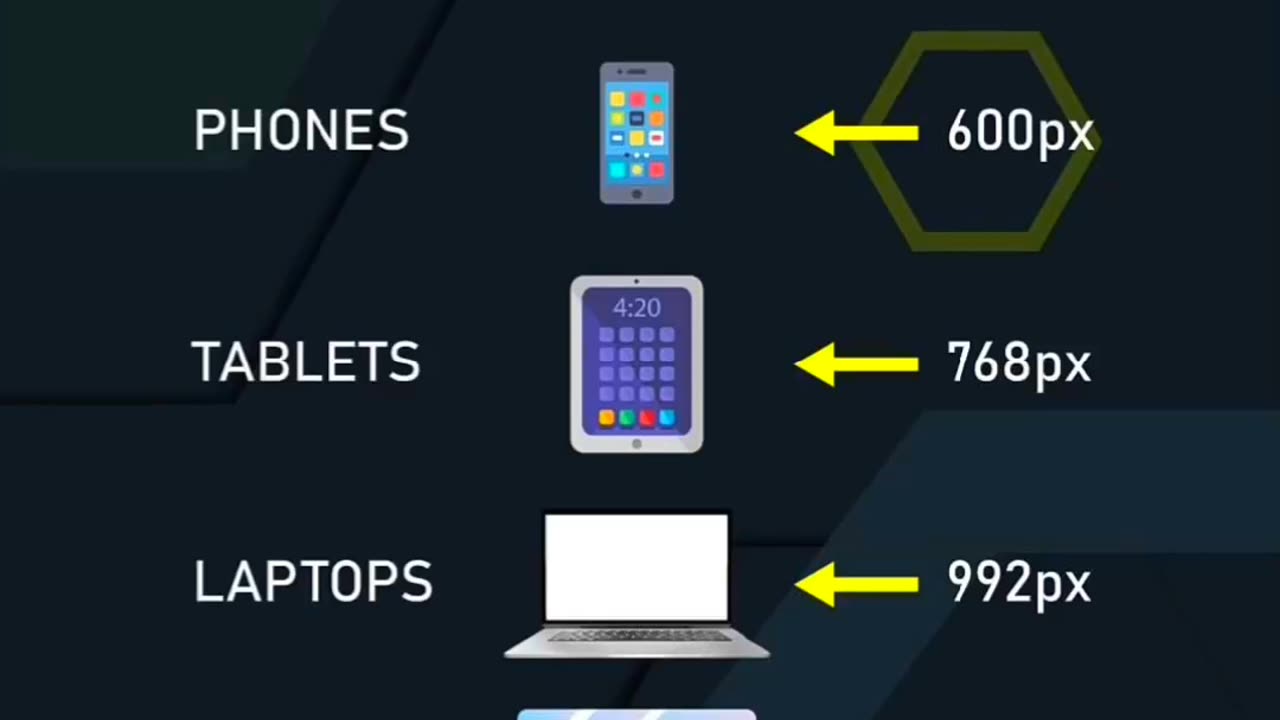
Learn how to create responsive web designs by mastering the concept of screen size breakpoints using CSS media queries. In this tutorial, we'll explore how to adapt your website layout and styling based on different device screen sizes, such as desktops, tablets, and mobile devices. Discover the key principles behind responsive design and how to define breakpoints using CSS media queries. With practical examples and tips, you'll gain the knowledge and skills to make your website look great on any screen, ensuring a seamless user experience across various devices. Join us and unlock the secrets of responsive screen size breakpoints in this comprehensive tutorial.
-
 25:49
25:49
Stephen Gardner
8 hours ago🔴Trump Was RIGHT! Newsom’s HUMILIATING Report EXPOSED!
48.6K23 -
 1:36:46
Tucker Carlson
6 hours agoThe Pentagon Didn’t Fire Dan Caldwell Over Leaks. They Fired Him for Opposing War With Iran.
131K170 -
 LIVE
LIVE
SpartakusLIVE
7 hours agoGames w/ StoneMountain64 || Duos w/ StevieT into the night
626 watching -
 1:34:18
JustPearlyThings
6 hours agoHigh Value Men Are Happy With Wives That Are Mid (Call-in Show) | Pearl Daily
45.5K25 -
 10:32:15
ttvglamourx
12 hours ago $2.65 earnedBIRTHDAY STREAM !DISCORD
36.1K10 -
![[Macho Madness] Featuring G2G, Lanc & Mochi [ Fortnite --> Ghost Recon Wild Lands ]](https://1a-1791.com/video/fww1/fe/s8/1/h/g/6/D/hg6Dy.0kob-small-Macho-Madness-Featuring-G2G.jpg) LIVE
LIVE
CHiLi XDD
7 hours ago[Macho Madness] Featuring G2G, Lanc & Mochi [ Fortnite --> Ghost Recon Wild Lands ]
115 watching -
 2:17:35
We Like Shooting
18 hours ago $3.27 earnedWe Like Shooting 607 (Gun Podcast)
43.9K2 -
 2:01:40
Joker Effect
4 hours agoYOU WOULD NEVER CLICK THIS BECAUSE YOU ARE SCARED YOU WILL LOVE IT.
34.4K3 -
 UPCOMING
Anthony Rogers
1 day agoEpisode 363 - Can A.I. Be Used to Talk to the Dead?
21.7K2 -
 6:14:39
Meisters of Madness
8 hours agoThe Umbral Playthrough - Part 2
21.6K1