Premium Only Content

NASA's Garbage Patch Visualization Experiment
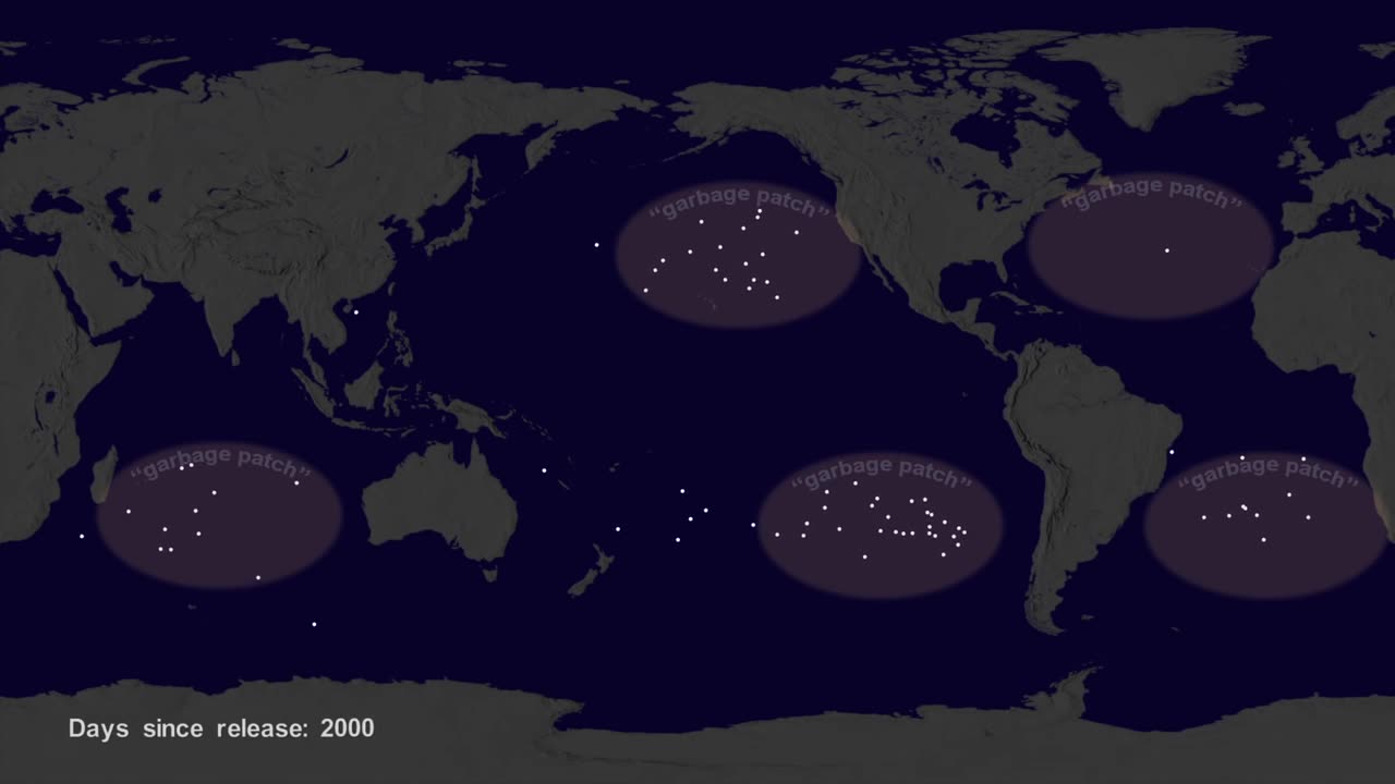
Hi, it’s Greg Shirah from NASA’s Scientific Visualization Studio. We wanted to see if we could visualize the so-called ocean garbage patches. We start with data from floating, scientific buoys that NOAA has been distributing in the oceans for the last 35-years represented here as white dots. Let's speed up time to see where the buoys go... Since new buoys are continually released, it's hard to tell where older buoys move to. Let's clear the map and add the starting locations of all the buoys… Interesting patterns appear all over the place. Lines of buoys are due to ships and planes that released buoys periodically.If we let all of the buoys go at the same time, we can observe buoy migration patterns. The number of buoys decreases because some buoys don't last as long as others. The buoys migrate to 5 known gyres also called ocean garbage patches. We can also see this in a computational model of ocean currents called ECCO-2.We release particles evenly around the world and let the modeled currents carry the particles. The particles from the model also migrate to the garbage patches. Even though the retimed buoys and modeled particles did not react to currents at the same times, the fact that the data tend to accumulate in the same regions show how robust the result is.
-
 LIVE
LIVE
Vocalot
23 hours agoDay 6! New Here! New Rumble Friends!? 🤙
2,072 watching -
 34:27
34:27
The Connect: With Johnny Mitchell
17 hours ago $12.36 earnedCan He Stop Them? Inside Trumps War On Mexican Drug Cartels & The New Era Of Mexican Organized Crime
31.6K16 -
 2:33:15
Tundra Tactical
9 hours ago $10.90 earnedLuis Valdes Of GOA Joins The Worlds Okayest Firearms Live Stream!!!
33.9K -
 1:03:41
Man in America
18 hours agoAre Trump & Musk the COUNTER-ELITES? w/ Derrick Broze
84.3K44 -
 3:45:08
DLDAfterDark
9 hours ago $10.77 earnedDLD Live! SHTF Handguns! Which Would You Choose?
46K2 -
 1:50:38
Mally_Mouse
11 hours agoSaturday Shenanigans!! - Let's Play: Mario Party Jamboree
55.8K -
 1:13:00
Patriots With Grit
15 hours agoWill Americans Rise Up? | Jeff Calhoun
46.2K13 -
 14:55
14:55
Exploring With Nug
15 hours ago $11.56 earnedWe Found Semi Truck Containers While Searching for Missing Man!
62K9 -
 27:57
27:57
MYLUNCHBREAK CHANNEL PAGE
23 hours agoOff Limits to the Public - Pt 3
142K69 -
 38:07
38:07
Michael Franzese
16 hours agoLeaving Organized Crime and Uncovering Mob in Politics: Tudor Dixon and Michael Franzese
111K15