Premium Only Content

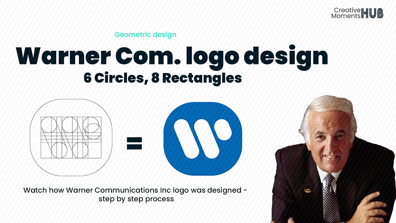
Warner Communications Logo Design Simplified with Shapes - How To Design LG Logo
In 1972, Warner Communications Inc. emerged as a result of the division of Kinney Nationals Company following a financial scandal related to its parking operations. To signify its ownership of Warner Bros., the company underwent a name change and adopted a new logo designed by Saul Bass. This logo featured a stylized W, which was later embraced by several of its subsidiaries
................
The geometric design is characterized by the use of clean, precise, and structured elements. In this approach, designers rely on basic geometric shapes like circles, squares, triangles, and rectangles, as well as straight lines and curves.
..................................................
- Hello there, I appreciate your support - comments, likes, and sharing this video - Let's make this Creative Hub a family with special moments - thank you
........................
Background music - Violet Vape - Cheel
Let's Connect social media platform
Twitter -
https://twitter.com/CMHub_
Instagram -
https://www.instagram.com/creativemomentshub/
Facebook -
https://www.facebook.com/CreativeMomentsHub
tiktok -
https://www.tiktok.com/@creativemomentshub?_t=8dY8dGuG2Tu&_r=1
rumble -
https://rumble.com/register/CreativeMomentsHub/
Do you want your brand's logo, we are just a WhatsApp message away- https://wa.me/message/CFCJ3Q4RTYK3C1
#creativehub #creativemoments #thehub #elonmus @apple #twitter #vodafone #geometricdesign #logo #logodesign #design #graphicdesign #illustration #youtube #apple #applemusic #applemusic #applelogo #applelogodesign #vodaphoneidea #vodafonetv #companylogo #lg #LG #technology #electronics @WarnerBrosPictures @warnermusicitalia @WarnerMusicMexico #warnerbros #warnerbrospictures #dc #dccomics #howto #howtodraw #nickelodeon
-
 UPCOMING
Edge of Wonder
4 hours agoLA Fires: Biblical Inferno as Hollywood Burned Down
1.32K2 -
 12:35
12:35
China Uncensored
3 hours agoHas the Coverup Already Begun?
1.35K14 -
 LIVE
LIVE
The Big Mig™
6 hours agoLet’s Talk Music “Karmageddon” w/ Iyah May
5,118 watching -
 LIVE
LIVE
Sarah Westall
1 hour agoLoss of Confidence in the Medical System, Real Facts and Data w/ Dr. Michael Schwartz
225 watching -
 LIVE
LIVE
LFA TV
23 hours agoThe Cause of ‘Natural’ Disasters | TRUMPET DAILY 1.10.25 7pm
384 watching -
 LIVE
LIVE
2 MIKES LIVE
1 hour ago2 MIKES LIVE #165 Open Mike Friday with Special Surprise Guests!
159 watching -
 1:01:18
PMG
23 hours ago $0.01 earnedIs the UK Grooming Issue Alive in America & How Are Those DEI Fire Policies Working in CA?
1.35K1 -
 2:01:49
Revenge of the Cis
4 hours agoEpisode 1428: Who Did This?!
15.9K2 -
 36:00
36:00
Candace Show Podcast
4 hours agoI Got A Legal Threat From A Sitting President… | Candace Ep 130
55.8K263 -
 1:02:24
In The Litter Box w/ Jewels & Catturd
1 day agoNewscum Busted | In the Litter Box w/ Jewels & Catturd – Ep. 717 – 1/10/2025
69.7K101