Premium Only Content

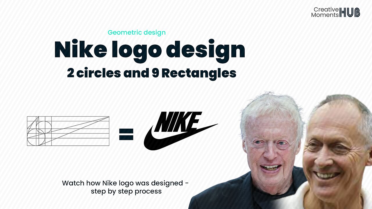
How Nike Logo was designed two circles and 9 rectangles - Geometric Design
The geometric design is characterized by using clean, precise, and structured elements. In this approach, designers rely on basic geometric shapes like circles, squares, triangles, rectangles, straight lines, and curves.
Nike, Inc. is an American multinational corporation that is engaged in the design, development, manufacturing, and worldwide marketing and sales of footwear, apparel, equipment, accessories, and services. Founded on January 25, 1964, by Bill Bowerman and Phil Knight - source - Wikipedia
Carolyn Davidson is an American graphic designer who designed the Nike Swoosh logo - Courtesy
..................................................
- Hello there, I appreciate your support - comments, likes, and sharing this video - Let's make this Creative Hub a family with memorable moments - thank you
........................
#backgroundmusic - Glass - Anno Domini Beats
Follow our social media handles
Twitter - https://twitter.com/CMHub_
Instagram - https://www.instagram.com/creativemomentshub/
facebook - https://www.facebook.com/CreativeMomentsHub
tiktok - https://www.tiktok.com/@creativemomentshub?_t=8dY8dGuG2Tu&_r=1
rumble - https://rumble.com/register/CreativeMomentsHub/
whatsApp - https://wa.me/message/CFCJ3Q4RTYK3C1
#creativehub #creativemoments #thehub #elonmus @apple #twitter #vodafone #geometricdesign #logo #logodesign #design #graphicdesign #illustration #youtube #apple #applemusic #applemusic #applelogo #applelogodesign #vodaphoneidea #vodafonetv #companylogo #lg #LG #technology #electronics
-
 10:19
10:19
Chrissy Clark
12 hours agoCNN’s BILLION Dollar Defamation Trial
6.96K5 -
 1:00:27
Trumpet Daily
19 hours ago $3.91 earnedCongress Humiliates Itself - Trumpet Daily | Jan. 15, 2025
9.31K15 -
 1:49:46
Glenn Greenwald
1 day agoTrump Fosters A Peace Deal With Israel & Gaza; Trump's Pressure On Israel Embarrasses His Enemies & Provides Foreign Policy Clues; Rubio & Hegseth On War And Militarism | SYSTEM UPDATE #389
112K183 -
 1:28:46
Donald Trump Jr.
19 hours agoOut of this World: Breaking News Investigation on Secret Alien Aircrafts, Live with Ross Coulthart & Lue Elizondo | TRIGGERED Ep.207
322K468 -
 1:39:31
Space Ice
15 hours agoSpace Ice & Redeye: Battlefield Earth & Rob Schneider
81.1K7 -
 1:33:38
Flyover Conservatives
1 day agoAMANDA GRACE | Prophetic Warnings Ignored: What Happens When Leaders Defy God | FOC Show
67.2K27 -
 59:57
59:57
The StoneZONE with Roger Stone
13 hours agoMEDICAL MURDER: A Sneak Peak into the Making of Died Suddenly 2 | The StoneZONE w/ Roger Stone
55.2K12 -
 1:07:03
Tucker Carlson
13 hours agoMother of Likely Murdered OpenAI Whistleblower Reveals All, Calls for Investigation of Sam Altman
155K192 -
 55:44
55:44
LFA TV
20 hours agoCongress Humiliates Itself | TRUMPET DAILY 1.15.25 7pm
153K58 -
 1:42:04
2 MIKES LIVE
14 hours ago2 MIKES LIVE #167 News Breakdown Wednesday!
96.4K16