Premium Only Content

How To Create A Floating Bottom Mobile Menu
#divitutorials #photoshop #changetherules
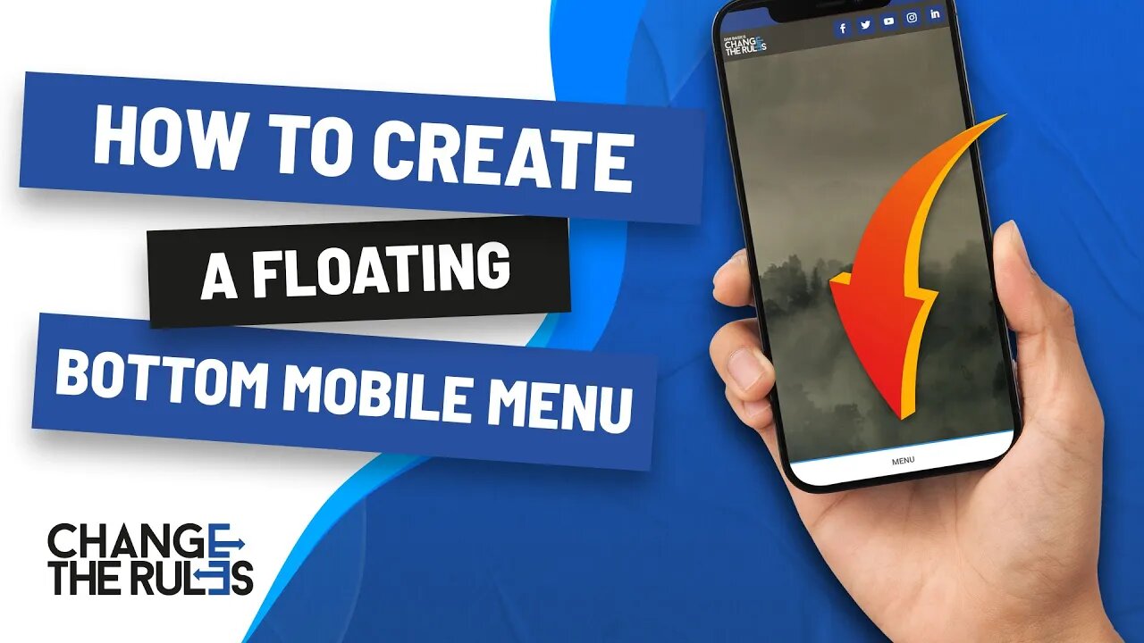
This tutorial will show you how to create a custom mobile floating navigation that will stick on the bottom of your device's screen.
The main purpose of this tutorial is to show where they can be able to access the navigation on their mobile phones because not all people know what a "hamburger menu" is. Some just replace the hamburber menu with a label "menu." That way, your website visitors won't get lost on your site.
Also, based on what I have experienced on my past projects, some clients require their social media icons to be placed on top, and that will be a problem on mobile screens.
I hope this simple technique will help you solve that problem.
You may post your comments or questions below and I will reply to you as soon as possible.
► DEMO LINK: https://bit.ly/3rG8LDd
► FOR THE CODE PLEASE VISIT THE WEB VERSION
OF THIS TUTORIAL.
WEB VERSION: https://bit.ly/3zeXfTB
► https://99designs.com/profiles/changetherules
► https://www.instagram.com/changetherulesdesign/
► https://twitter.com/ctrdesignonline
► https://changetherules.online/
#webdesign #landingpage #bannerads #99designs #affordable #divi #bootstrap #html #wordpress #filipinowebdesigner #tutorials #basics
-
 DVR
DVR
GOP
21 hours agoPresident Trump Speaks at the Commander-In-Chief Ball
80.3K24 -
 1:45:10
Glenn Greenwald
6 hours agoTrump is Inaugurated & Immediately Issues Executive Orders; Biden Pardons His Family, Liz Cheney, Fauci; Michael Tracey DC Interviews | SYSTEM UPDATE #392
109K138 -
 2:03:43
Kim Iversen
6 hours agoTrump’s Triumphant Return: Breaking Down Trump’s Bold 2025 Agenda | The TikTok Ban Backlash: Who Wins, Who Loses?
54.7K34 -
 3:45:23
Benny Johnson
7 hours ago🚨 Watch President Trump FREE January 6th Political Prisoners LIVE Right Now | Stadium ROARS
229K201 -
 5:19:30
Donald J. Trump
10 hours agoDonald J. Trump Attends the Presidential Parade
564K546 -
 DVR
DVR
GOP
22 hours agoDonald J. Trump Attends the Presidential Parade
254K78 -
 11:51:52
Right Side Broadcasting Network
7 days agoLIVE REPLAY: Inauguration of the 47th President Donald Trump, and Presidential Parade - 1/20/25
1.21M567 -
 4:25:55
Kimberly Guilfoyle
9 hours agoLive Inauguration Day Coverage
158K47 -
 1:06:10
LFA TV
1 day agoThe Return of 45 | TRUMPET DAILY 1.20.25 7pm
64.3K -
 1:50:51
2 MIKES LIVE
5 hours ago2 MIKES LIVE #169 Inauguration Day Special!
41.1K10