Premium Only Content

Domino's Pizza appropriates its logo to make braille simpler to read
Although their meaning is not always clear, logos enable each brand to have its unique identity and to immediately distinguish itself in a world full of visual stimuli. Some logos, however, like the one for Domino's Pizza, which can resemble the Braille code's dot pattern, can actually function as inclusion vectors.
In response to the similarities they saw between the visual identity of the sign and the tactile writing method used by the blind, students from the Ecuadorian advertising school The Pub School developed the "Blind Code" campaign in honor of World Braille Day, which is observed on January 4.
Then, in order to make the restaurant chain's first Braille menu accessible to those who are blind, they appropriated its domino-shaped trademark.
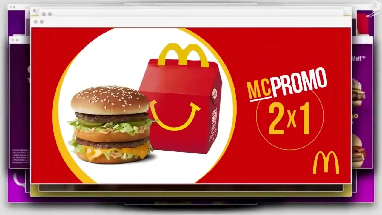
They went over all of the brand's media again, starting with the pizza boxes and menus that listed the available pies' names, ingredients, and promotional offers in Braille. But they didn't stop there; braille words were also added to the menus, specials, and deals of rival fast-food restaurants including McDonald's, Burger King, and KFC.
-
 1:01:17
The StoneZONE with Roger Stone
13 hours agoChristmas Edition: Why the Panama Canal is Part of the America First Agenda | The StoneZONE
102K33 -
 18:12:15
LFA TV
1 day agoLFA TV CHRISTMAS EVE REPLAY
123K14 -
 13:32
13:32
Scammer Payback
14 hours agoChanging the Scammer's Desktop Background to his Location
1.21K2 -
 4:21
4:21
BIG NEM
16 hours agoNikola Tesla's Secret to Cultivating Creativity & Genius
851 -
 15:03
15:03
The Anthony Rogers Show
1 day agoAnthony Rogers - Live at Cusumano's Pizza (Upstairs)
1671 -
 4:33:48
tacetmort3m
1 day ago🔴 LIVE - THE ZONE KEEPS PULLING ME BACK - STALKER 2 - PART 15
65.1K12 -
 22:45
22:45
Brewzle
20 hours agoI Went Drinking In A Real Bourbon Castle
46.5K4 -
 48:36
48:36
PMG
1 day ago $3.77 earned"Parkland Parent Speaks Out On Kamala Harris Using Victims"
38K12 -
 4:06
4:06
The Lou Holtz Show
19 hours agoCoach Lou Holtz’s Heartfelt Christmas Message 🎄 | Family, Faith & Notre Dame Spirit 💚 #christmas
28.1K -
![ROSEANNE BARR - Her Journey, TRUMP, and the MAGA GOLDEN AGE! [INTERVIEW]](https://1a-1791.com/video/s8/1/M/m/B/2/MmB2v.0kob.1-small-ROSEANNE-BARR-Her-Journey-T.jpg) 51:35
51:35
Dr Steve Turley
1 day ago $20.43 earnedROSEANNE BARR - Her Journey, TRUMP, and the MAGA GOLDEN AGE! [INTERVIEW]
62.7K54