Premium Only Content

Chart Types
A chart is simply a visual representation of a currency pairs price over a set period of time. Let's take a look at the 3 most popular types of price charts.
1: Line
2: Bar chart.
3: Candlestick chart.
Line charts are drawn by simply connecting one closing price to the next closing price in one single line. The main advantage of this type of chart is that it's extremely clean that it filters out a lot of market noise.
A bar chart is a little more complex it shows the opening and closing prices as well as the highs and lows. The horizontal line on the left shows the opening price, the bottom of the vertical line shows the lowest price for that specific time. The horizontal price on the right shows the closing price while the top of the vertical line shows the highest price for that specific time.
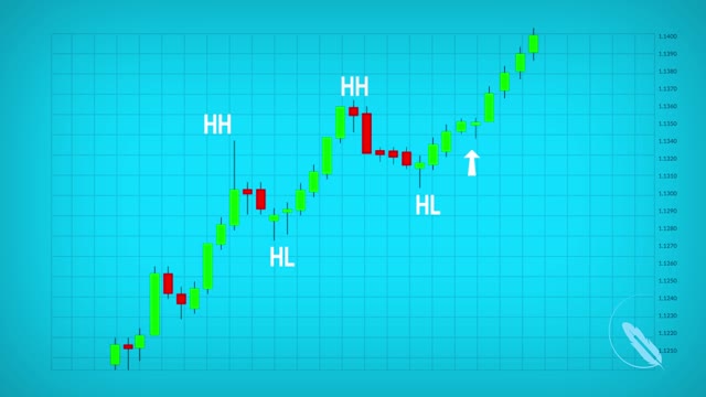
The candle stick chart is a variation of the bar chart. Candlestick charts show the same price information as a bar chart but in a prettier graphic format. The larger blocks in the middle are called bodies. The vertical lines above the body are called the upper shadow. The vertical lines below the body are called lower shadows. Green body candles indicate that the currency closes above the opening price. Red body candles indicate that the currency closes below the opening price. Candlesticks are easy to interpret and are a good place for beginners to start figuring out forex chart analysis.
-
 2:12:46
TheSaltyCracker
14 hours agoLefties Think Elon Stole Election ReeEEeE Stream 11-10-24
223K408 -
 1:16:52
vivafrei
15 hours agoNEW STREAM! Sorry peeps
155K147 -
 5:56:14
SNEAKO
15 hours agoCheesur edate, Jake Shields & Myron Gaines on election
114K6 -
 39:34
39:34
Nerdrotic
16 hours ago $56.21 earnedAirbursts with Dr Malcolm LeCompte & Giants and Ancient Civilizations with Hugh Newman - Forbidden Frontier
123K17 -
 1:03:38
vivafrei
23 hours agoElection RECAP! Long-Count Chicanery! FULL Jan. 6 Pardons! Let's Mock Lichtman & MORE! Viva Frei
172K176 -
 7:52:09
Vigilant News Network
18 hours agoDoctors Drop Post-Election COVID Bombshell | Media Blackout
176K8 -
 14:13
14:13
Scammer Payback
12 days agoTelling Scammers Their Address
165K93 -
 5:43:21
Barstool Gambling
21 hours agoBig Cat and Co Sweat Out the Week 10 Sunday Slate | Barstool Gambling Cave
124K7 -
 2:49:36
The Jimmy Dore Show
2 days agoRumble Time Live w/ Jimmy Dore & Special Guests Roseanne Barr, Dr. Drew, Drea de Matteo & More!
586K725 -
 17:17
17:17
DeVory Darkins
1 day agoKamala Post-Election BOMBSHELL Exposes $1 BILLION Campaign DISASTER
110K282