Premium Only Content
This video is only available to Rumble Premium subscribers. Subscribe to
enjoy exclusive content and ad-free viewing.

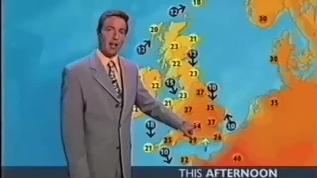
📺☀️ Video of two BBC weather forecasts with a difference of 19 years
2 years ago
38
1️⃣ The weekend in 2003 was warmer than planned, and most of the map is yellow/orange.
2️⃣ 2022 almost the entire map is red.
***
Some may say it’s only a difference of colour, that’s true, but red signals danger, and orange signals normality, it’s very subtle but it is emotive programming.
Loading comments...
-
 43:48
43:48
BonginoReport
8 hours agoMainstream Media Plots The Next Plandemic! (Ep.02) - 03/11/2025
134K275 -
 1:13:13
Michael Franzese
8 hours agoMegyn Kelly’s UNFILTERED Take on The Ukraine War, Trump & Modern Masculinity
99.8K42 -
 1:43:21
Redacted News
9 hours agoBREAKING! UKRAINE AGREES TO CEASEFIRE WITH RUSSIA... BUT THERE'S A BIG CATCH | Redacted News
178K315 -
 58:17
58:17
Candace Show Podcast
10 hours agoShould We Feel Bad For Blake Lively? | Candace Ep 157
158K295 -
 3:06:52
The Nerd Realm
11 hours ago $11.96 earnedHollow Knight Voidheart Edition #19 | Nerd Realm Playthrough
95K6 -
 1:17:27
Awaken With JP
13 hours agoThe Current Thing: Tesla Protesting - LIES Ep 82
155K75 -
 1:07:08
Sean Unpaved
10 hours agoNFL Free Agency Rolls On! MLB Spring Training Heats Up along with 3x World Series Champ Dave Stewart
92.8K3 -
 2:10:15
Right Side Broadcasting Network
15 hours agoLIVE REPLAY: White House Press Secretary Karoline Leavitt Holds Press Briefing - 3/11/25
182K45 -
 2:06:00
The Quartering
13 hours agoTrump Goes NUCLEAR On Canada, Blasts Massie, Harry Potter Race Swap, Man Humiliated On TV Show
128K69 -
 1:03:09
The White House
13 hours agoPress Secretary Karoline Leavitt Briefs Members of the Media, Mar. 11, 2025
121K73