Premium Only Content

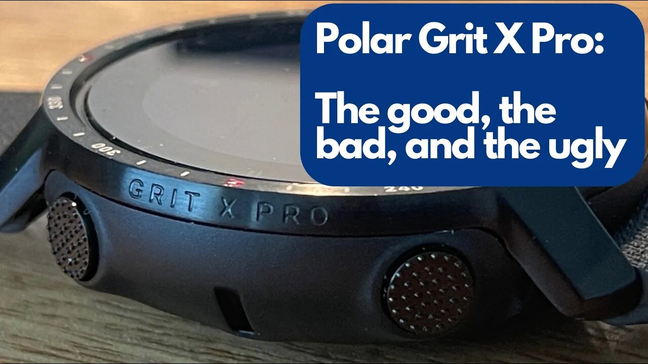
Polar Grit X Pro - The Good, the Bad, and the Ugly.
This is the…fourth Polar i’ve reviewed. I started with the Vantage V, then the first Grit X, and my last dance with Polar was the Vantage V2. All of them were actually pretty good, but as I mentioned in my review of the insanely robust Vantage V2 there was room for improvement (and, I secretly wanted something with ALL those features that looked less like a fitbit and more like a real watch). At the time, the Grit X’s functionality didn’t match the V2.
Fast forward to the Grit X Pro, and it’s exactly what I asked for: a V2 in a Grit X wrapper. You get military spec durability with a real sapphire crystal and INSANE battery life. In other words, it looks like a watch, it wears like a watch, but it’s oh so much more.
And for me - that’s where the good, bad, and ugly starts. First off - I’ve had this watch for several months, and haven’t even scratched the surface on all the features - you get all the greatest hits from the previous models: music control, leg recovery, preloaded workouts, and probably one of the most feature packed activity and sleep trackers you can buy. There’s also performance and recovery testing - and it has Precision Prime™ OHR GPS tracking built in. That means you’ll always know where to go with turn-by-turn guidance and built-in GPS. It also has a ‘track back’ feature to help you find your way home, and you can also view the elevation profile of your activity. The baked in GPS also means you have access to an altimeter, gps coordinates, a compass, and weather updates including daylight and sunset times.
You can also gauge your training load, set hydration and nutrition reminders, and it’ll notify you when you get just about ANY smartphone notification from Slack to Ring and everything in between. This is ALL very, very good.
But here’s where it gets bad…for me, at least: it’s just too much for my middle-aged brain to handle, and like I said: in the 6ish months that I’ve owned this watch I haven’t used 70 percent of the features. And it’s not for a lack of trying - I’ve been super active but I’m also super short on time so going down the rabbit hole with a device just isn’t on my checklist anymore. Would I benefit from all these fitness tests and recovery tracking - oh without a doubt - but TBH I simply don’t have the motivation for that stuff anymore. But…that’s all on me, empirically it doesn’t take away from how amazing this device really is.
By now, I’m sure you’re wondering about the ugly in this good/bad/ugly sandwich. Well, here it is, and it’s two things: like before, I still think the Polar Flow app and the syncing process stinks. But I think that’s because they’re trying to stuff 50 pounds worth of available data into a five pound app. There’s just too many permutations for the available data, and Again - I don’t have the time, motivation, or patience to sit down and make the most of it anymore.
But, probably the ugliest thing - and it’s a really simple thing to fix - is this: when it’s on my wrist, and my hands are on the bars, I can’t read the screen because it simply doesn’t have enough contrast. The dark background mixed with the light grey numbers is terrible, and if you add in ANY glare off the crystal it’s totally illegible and useless. ALL THEY NEED to fix this is a simple reversal of the colors - give me a bright white screen with dark, bold black letters. I don’t CARE if that means I get 4 days of battery instead of 7. I don’t wear it on the bike anymore because it’s only useful before and after the ride. UNLESS I’m using the music feature - which is the ONE thing that kept it on my wrist because being able to wear airpods and control the volume without digging around for my phone is actually very very cool.
Any other time - the band is super comfortable, it’s lightweight but substantial, it looks REALLY good, and the notification features are super convenient. Unfortunately, I’m an analog kid in a digital world and the Grit X pro is just too damn smart for me.
-
 4:51:59
MyronGainesX
15 hours agoIRS Auctions Off Tekashi 69's Possessions
188K28 -
 DVR
DVR
Vigilant News Network
1 day agoRFK Jr. Hearing EXPOSES Corrupt Politicians in Humiliating Scandal | Media Blackout
194K57 -
 1:11:40
Josh Pate's College Football Show
14 hours ago $6.17 earnedPerfect CFB Conferences | Big Ohio State Changes | Canceling Spring Games | SEC 2025 Thoughts
69.3K2 -
 1:08:07
Bek Lover Podcast
11 hours agoInteresting Times with Bek Lover Podcast
37.8K -
 1:51:12
Tate Speech by Andrew Tate
15 hours agoEMERGENCY MEETING EPISODE 105 - UNBURDENED
216K109 -
 1:01:18
Tactical Advisor
17 hours agoBuilding a 308 AR10 Live! | Vault Room Live Stream 016
196K20 -
 2:17:02
Tundra Tactical
1 day ago $30.11 earnedTundra Nation Live : Shawn Of S2 Armament Joins The Boys
280K29 -
 23:22
23:22
MYLUNCHBREAK CHANNEL PAGE
2 days agoUnder The Necropolis - Pt 5
218K71 -
 54:05
54:05
TheGetCanceledPodcast
1 day ago $15.27 earnedThe GCP Ep.11 | Smack White Talks Smack DVD Vs WorldStar, Battle Rap, Universal Hood Pass & More...
209K36 -
 8:30
8:30
Game On!
22 hours ago $1.10 earnedLakers BLOCKBUSTER trade! Luka Doncic is coming to LA!
36.9K4