Premium Only Content

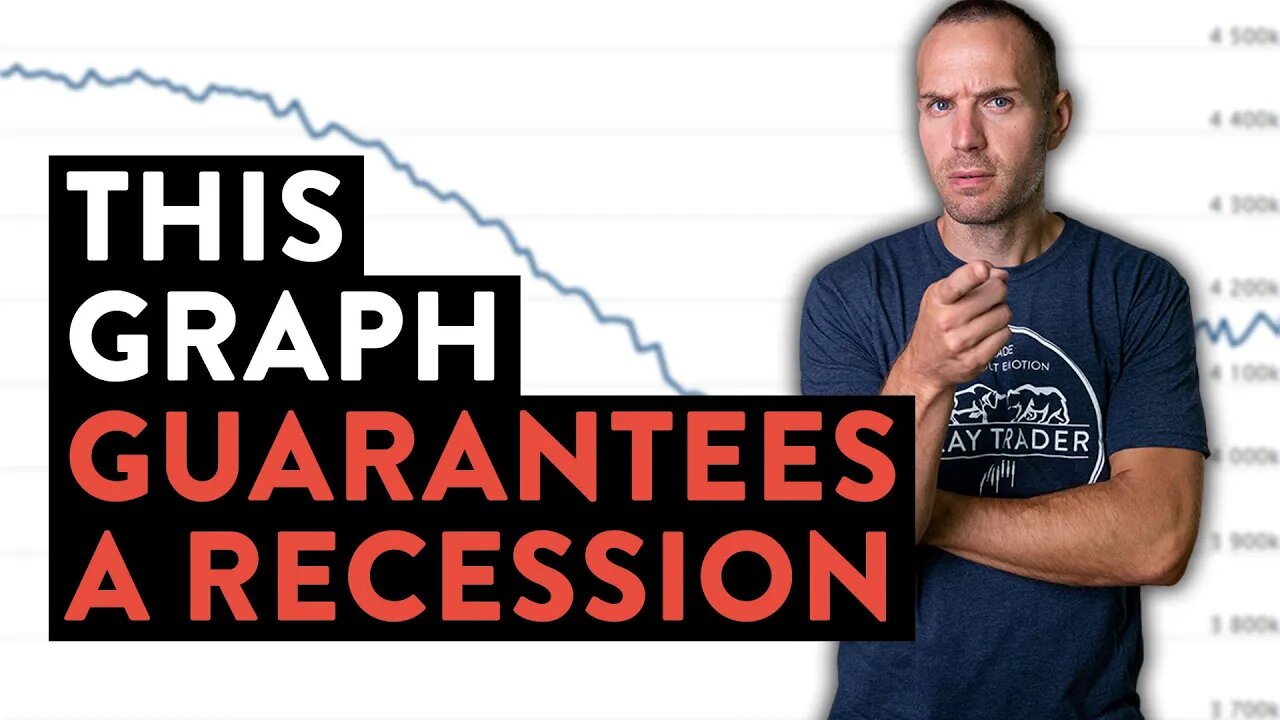
This Graph Guarantees a Painful Recession… (maybe Depression?)
It amazes me how the mainstream financial media overlooks such basic graphs that illustrate such powerful topics of consideration. Unfortunately, the graph I will show you in this video guarantees a painful recession (if not a depression!). Oftentimes the best predictor of the future is looking backwards into history. I realize that past history does not guarantee future results; however, when you consider the context of the last time in history a balance sheet reduction occurred and combine that with the current state of affairs… uh oh! I don’t mean to be so pessimistic, but it’s hard to be positive when all the data is staring you in the face screaming, “be ready for pain!”. You don’t need to be an economist to analyze this graph and see all the red flags it presents to our current economic conditions. Inflation is a massive problem and needs to be fixed. Will the federal reserve do what it promises to do? This graph suggests, if they do… it’s gonna be painful!
Monitor the Chart for Yourself: https://www.federalreserve.gov/monetarypolicy/bst_recenttrends.htm
This Free Event Reveals: How I transformed myself from an employee to my own boss (and how you can too, even with no experience!). Register: https://claytrader.com/1-hour-trader-transformation/?utm_source=social&utm_medium=youtube
Enjoy this Free Content? I'm confident you'd enjoy my premium training courses then: https://claytrader.com/training/?utm_source=social&utm_medium=youtube
Hear real-life trading journeys from "normal" people: The Stock Trading Reality Podcast - https://claytrader.com/podcast/?utm_source=social&utm_medium=youtube
Pick up some ClayTrader gear at https://daytradergear.com/?utm_source=social&utm_medium=youtube
-
![[LIVE] Day Trading | Keeping Losing Trades “Basic”](https://1a-1791.com/video/s8/1/H/n/K/7/HnK7n.0kob-small-LIVE-Day-Trading-Keeping-Lo.jpg) 18:20
18:20
Clay Trader
1 year ago[LIVE] Day Trading | Keeping Losing Trades “Basic”
3072 -

RG_GerkClan
3 hours ago🔴LIVE - Dominating One Raid at a Time - Escape From Tarkov - Gerk Clan
15.1K -
 LIVE
LIVE
Major League Fishing
2 days agoLIVE! - Bass Pro Tour: Stage 1 - Day 3
541 watching -
 1:49:43
Game On!
12 hours ago $1.64 earnedNFL Experts Top 10 Super Bowl Props!
13.8K2 -
 28:31
28:31
SB Mowing
1 day agoSiblings FEUD went so far the grass grew TALLER THAN THE HOUSE
56.8K11 -
 26:32
26:32
Stephen Gardner
14 hours ago🔥Tulsi Gabbard DROPS BOMBSHELL Obama Secret during hearing!
64.2K94 -
 4:42
4:42
SeasonofMist
5 months agoSYLVAINE - Dagsens Auga Sloknar Ut (Official Music Video)
34 -
 31:54
31:54
Jamie Kennedy
9 hours agoThe "Tolerant Left" is Getting Exposed
146 -
 1:00:39
Weberz Way
15 hours agoDEI NEEDS TO DIE, ANOTHER PLANE CRASH, & MAJOR TARIFFS BEING IMPOSED
154 -
 14:15
14:15
Ethical Preparedness
17 hours agoSecret Apocalyptic Pain Killing Weed that Big Pharma Tries to Hide from You -Post Collapse Medicine
2372