Premium Only Content

08- Matrix and Scatter chart
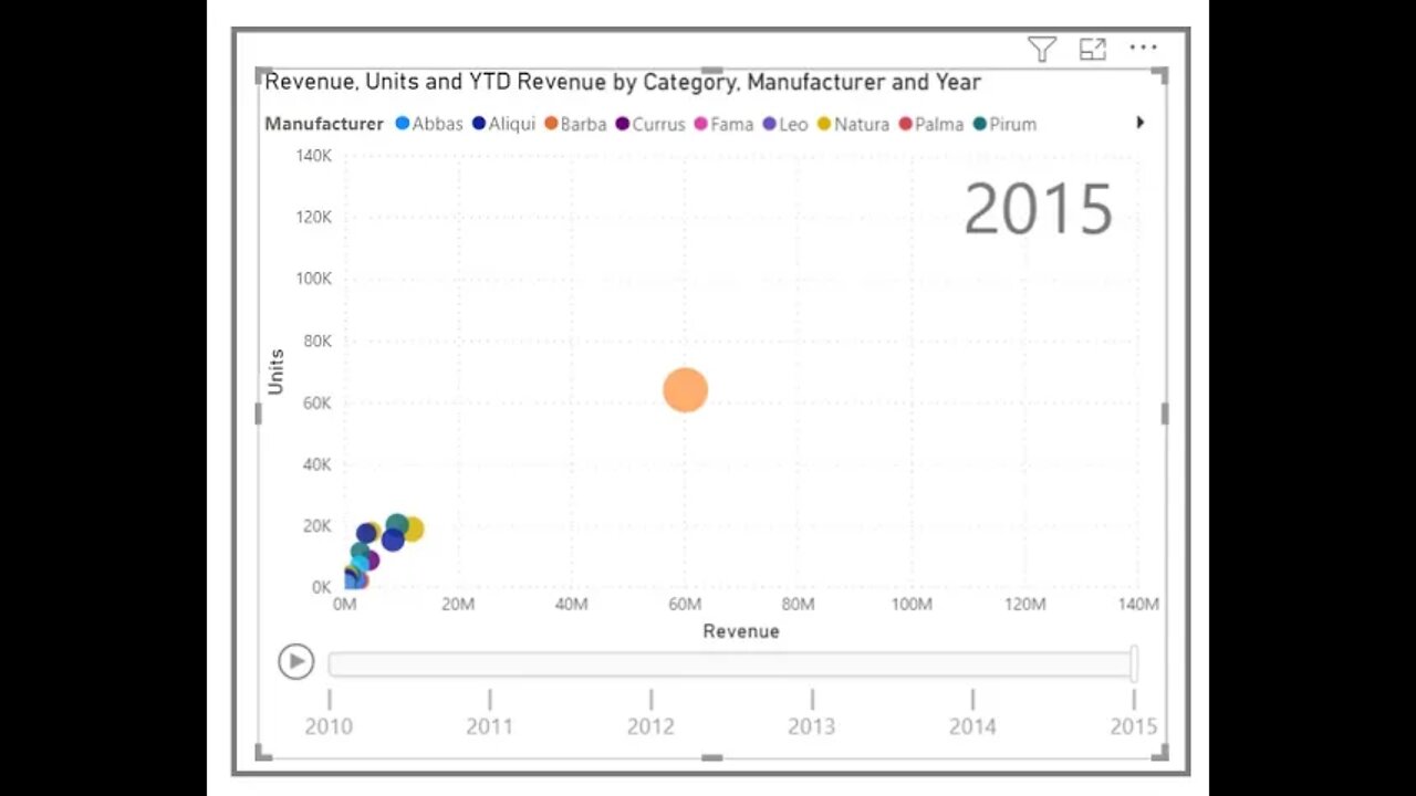
Use a scatter chart to compare two different measures, such as unit sales versus revenue.
To create a blank chart, select Scatter chart from the Visualizations pane. Drag and drop the two fields that you want to compare from the Fields pane to the X Axis and Y Axis option buckets. At this point, your scatter chart probably has a small bubble in the center of the visual. You need to add a measure to the Details bucket to indicate how you want to segment your data. For example, if you're comparing item sales and revenue, you might want to split the data by category, or manufacturer, or month of sale.
Adding another field to the Legend bucket will color-code your bubbles according to the field's value. You can also add a field to the Size bucket to alter the bubble size according to that value.
Scatter charts have many visual formatting options as well, such as turning on an outline for each colored bubble and switching between individual labels. You can change the data colors for other chart types as well.
You can create an animation of your bubble chart's changes over time by adding a time-based field to the Play Axis bucket. Select a bubble during an animation to see a trace of its path.
Note
Remember, if you only see one bubble in your scatter chart, it's because Power BI is aggregating your data, which is the default behavior. To get more bubbles, add a category to the Details bucket in the Visualizations pane.
-
 56:15
56:15
Candace Show Podcast
5 hours agoBREAKING: My FIRST Prison Phone Call With Harvey Weinstein | Candace Ep 153
107K72 -
 LIVE
LIVE
megimu32
1 hour agoON THE SUBJECT: The Epstein List & Disney Channel Original Movies Nostalgia!!
197 watching -
 9:06
9:06
Colion Noir
10 hours agoKid With Gun Shoots & Kills 2 Armed Robbers During Home Invasion
16.9K3 -
 54:28
54:28
LFA TV
1 day agoUnjust Man | TRUMPET DAILY 2.27.25 7PM
19.7K2 -
 20:10
20:10
CartierFamily
7 hours agoAndrew Schulz DESTROYS Charlamagne’s WOKE Meltdown on DOGE & Elon Musk!
36.8K45 -
 1:36:39
Redacted News
5 hours agoBOMBSHELL EPSTEIN SH*T SHOW JUST DROPPED ON WASHINGTON, WHAT IS THIS? | Redacted w Clayton Morris
145K245 -
 2:03:31
Revenge of the Cis
7 hours agoEpisode 1453: Fat & Fit
48.6K8 -
 2:38:12
The White House
7 hours agoPresident Trump Holds a Press Conference with Prime Minister Keir Starmer of the United Kingdom
160K60 -
 1:01:04
In The Litter Box w/ Jewels & Catturd
1 day agoDrain the Swamp! | In the Litter Box w/ Jewels & Catturd – Ep. 751 – 2/27/2025
91.7K35 -
 1:11:24
Dr. Drew
8 hours agoNEW: Cardiac Arrest In Healthy Young People After mRNA w/ Nicolas Hulscher – Ask Dr. Drew
72.7K32